
UX writers are a vital pillar for any digital project, whether an app, website or platform. Great UX writing avoids user frustration and helps provide users with an exceptional experience, even when error messages pop up.
However, achieving this is a challenging task that requires collaboration between the UX writer and the UX designer. Together, they must craft solutions that use positive language, ensure clear communication, and align with the brand voice while also considering numerous other factors.
One of the best ways to inspire your project and gather ideas for effective UX writing is to look at examples and UX copy pieces from other creators. If you’re searching for good UX writing examples, you have come to the right place.
Here, we will show you real cases of companies and writers who created great solutions for user experience copy. Make sure to look at each one to see how they can impact your project and inspire your next efforts as a UX writer.
Why Is UX Writing So Important

There are several reasons why a company should never look over the written content of their UX design project. From the error message when something goes wrong to the call-to-action button on your website, everything impacts the entire user experience. These can be decisive factors that encourage users to take certain actions or not.
However, the UX writer’s role doesn’t stop with creating messages. Good UX copy has to provide users with a clear and straightforward experience.
You must ensure you’re creating inclusive UX writing when developing your texts. This way, everyone can understand the message you’re trying to convey, regardless of where they’re from or any other aspect.
These tasks closely mirror those of UX designers and are equally essential. Poor UX writing, such as creating unclear error pages or using too many regional terms, can have a significant negative impact on a project. It can lead users to uninstall an app or avoid visiting a website altogether.
Parts Where UX Writing Is Indispensable

If you already know what UX writing is, you also have an idea of how impactful it is throughout the entire project. Here, we will show you some of the most crucial missions a UX writer undertakes, along with some examples of good UX choices. Treat them as an inspiration to create flawless communication and experience for your target audience.
Here are some of the most important aspects of UX writing and examples of applying them:
Voice and Tone
This is one of the main areas where the UX writer will impact the digital product being worked on. Usually, companies have a UX writing style guide, a document responsible for specifying various communication aspects, like tone, values, strategic elements, and other things.
The voice and tone determine the language you use with your audience and how you communicate with them. Some brands might require a more “human” touch and a more conversational tone, while others need a straightforward communication style with specific terms and formal specifications. Everything will depend on the industry and the image you want to convey.
Voice and tone are responsible for building brand personality and how people see your products. It must be carefully thought out before creating any error page or copy piece. Choosing the correct set of words can make a massive difference in the user’s mind and impact the brand’s personality.
Brand Voice Example
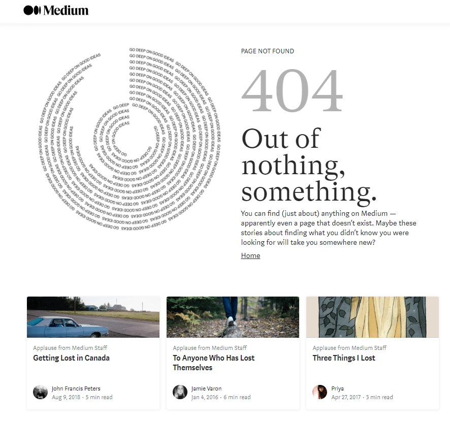
This is an excellent example of how a creative idea, aligned with the brand’s voice, is perfect for catching people’s attention, even though the message is an error on the platform. In this case, instead of displaying a simple and boring “page not found” message, Medium takes a different approach.
The brand is known for being a portal where you can find newsletters and articles on almost everything, from video game statistics to topics such as healthcare and engineering. This can be seen in the UX microcopy: “You can find (just about) anything on Medium.
The link featured at the bottom of the message also takes the user directly to other articles about other topics, perfectly matching the error message “Out of nothing, something.”
It is a creative solution for an error message that matches the voice and tone of the website. This way, the user gets positive associations even with error messages. UX stands for user experience, and making this experience memorable is the best way to ensure loyal customers and users.
Logins and Sign-ups
We know that sometimes, the logins and sign-ups can be highly boring parts of the process, especially when it requires numerous steps. Thoughtful user experience writing can help minimize the downsides of this experience and make the overall process much better for the user accessing the platform. Techniques like requiring fewer user actions at the first moment and completing the process in future actions are good alternatives to this issue. They can solve things in a simple manner that also feels natural.
To encourage new users as they enter the platform, consider including microcopy that reassures them, such as saying they’re almost finished or that everything is proceeding smoothly. This helps alleviate potential concerns and motivates them to continue completing the requests until they reach the end of the process.
According to MetricHQ, the average sign-up rate of a website revolves around 2% and 5%, while the top websites convert around 11%. Creating a catchy process that is both user-friendly and quick helps to improve accessibility and increases this percentage, helping your platform to stay way above the average.
Sign In Example
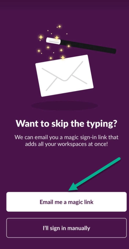
This is the perfect example of how UX design and writing can complement each other and provide additional support to the user so they can skip the tedious processes. In this excellent example from Slack, the user can click on an option that sends them a magic link that allows them to sync all their workspaces easily and instantly.
The platform provides an easy solution that makes it much more likely for the user to complete the process than if they had to type each requirement manually. Analyzing this case can generate numerous insights on creating your own successful microcopy.
But here, the idea’s success goes beyond just the helpful tool. It also features good writing in a casual tone that helps users understand what to do and the advantages of this alternative process. The metaphor usage of magic helps make it more accessible to all audiences. It creates a more informal actionable CTA, even though most people use Slack for professional purposes. It aligns all the UX writing principles with the brand’s communication style.
Interactive Email

Email marketing is one of the most common strategies companies use across industries, but it is also one of the hardest. No one likes receiving overly promotional emails or messages from brands, so featuring positive language and great UX writing can help improve the conversion rate of this action.
Whether you’re creating emails for a UX writing course, app download link, or anything else, using your creativity is the most crucial part here. Emails tend to be boring and too formal, so finding ways to make them attractive for users to read and interact with is indispensable.
Along with the copy part of the email itself, you also need to think of a catchy title that convinces people to open your message, even if they know it’s a promotional email. When writing copy of this kind, the call to action is also essential, and you should take as much time as you need to create something that will generate conversions more easily.
Email marketing is the format with the biggest ROI in the world, and an email interface is also part of the UX professional’s tasks. HubSpot states that every dollar spent on emailing customers generates a return of $36, showing how powerful this platform can be.
UX Writing Email Example
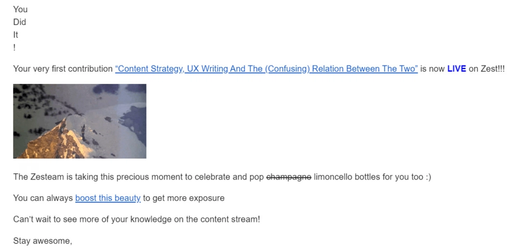
This automation from Zest sends you a congratulations message once your content is uploaded to the platform. It is part of the experience of using their website and makes the process much better, giving the user a sense of accomplishment and telling them that all the steps were successfully completed.
But more than just an email saying that the upload was done, the idea here is to send the user a congratulations message telling the users how vital their contribution is and how grateful the platform is for it. The email also features valuable information and links that redirect those reading to the article uploaded and a link to a boost program to increase visibility.
Even though it mixes marketing by offering this option, the main objective is to make the user feel like part of the platform and show them that the company cares about their old and new customers.
Accessibility
One of the most critical parts of the UX writing process is providing accessibility to whoever is using your digital product or platform. Using inclusive language and general terms are great examples of how writers can create error messages and other copy parts so that everyone can easily understand and perform the necessary actions.
The UX writer also guides users through the entire experience inside the platform, from the moment they enter the website or app to the moment they perform the final action. Ensuring everything is understandable regardless of region and demographics is vital for a professional in this area who wants to highlight in the online market.
Accessibility is a part of the project where every UX writer should show their ability to make the most inclusive content that communicates the brand’s identity and tone. Featuring these characteristics is one of the best UX writing practices and affects the customer’s opinion of your company.
Accessibility Example
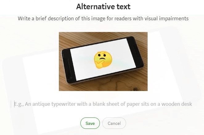
It is not surprising that Medium nails every aspect of UX design and writing, and accessibility is no exception. One of the platform’s latest projects turns its users into temporary UX writers and allows them to make the website more inclusive for those with visual disabilities.
The idea is that the platform’s users can describe what they see in the images to help anyone with visual impairment understand the picture, generating a better experience. It is an excellent example of how design and copy can work together to create accessible solutions.
The copy part of the tool instructs what they need to do and gives a short example to guide users as they help. The text part features clear actions and instructions, so there are no doubts during the process.
Other Examples

We showed you some examples directly related to the areas and parts of the project in which UX writing plays an important role, but there are many others to discover. Here, we will provide other examples of great ideas that help you gather new users and lower the cognitive load necessary for new users to understand how to use the platform properly.
Make sure to look at each one to see how they impact the overall structure of the app or digital solution. Here are other examples of good UX writing:
Duoligo’s Lesson Quitting
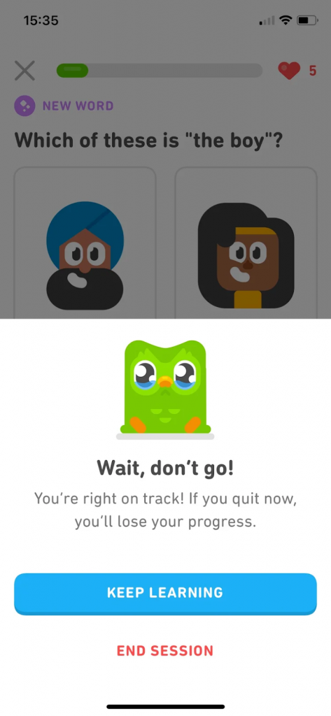
We all know the green bird has one of the catchiest communications in the world, whether when posting memes on social media or guiding a new user through the app. This is one of the most outstanding examples of how UX writing should be done.
The brand is known for its human (or birdy) touch in communication, and this can be seen when you try to quit a lesson you haven’t finished. Along with the emotive illustration of Duo crying and requesting you stay in the lesson, the UX copy includes simple text telling the students the consequences of the action and that they’ll lose their progress if they close the app. The CTA is also highlighted to convince the user to keep going and finish the lesson.
It’s a great example of how to mix the brand’s characteristic voice with UX writing elements to create an excellent, fun, and satisfying user experience. It is one of the UX writing examples that can inspire anyone who wants to create a catchy and friendly interface for their apps. Instead of just saying that they’ll lose everything they did, you present such information simply and emotionally so the experience when reading gets much better.
TripAdvisor’s Error 404
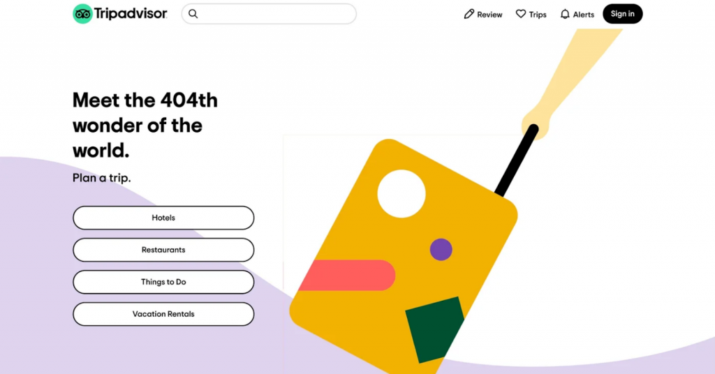
TripAdvisor is the world’s largest platform for hotel bookings and discovering activities when visiting a new destination, be it a different country or state. The website provides invaluable tips on local attractions and offers guides to the finest restaurants and hotels available for reservation, ensuring exceptional experience in the area.
Error 404 is a standard error message that can appear on any website when navigating the web. It indicates a page that could not be found due to many reasons.
Instead of displaying a simple and boring “page not found” message, TripAdvisor uses its content to its advantage when developing the website’s UX writing. The message informs the user about error 404 through a clever message that sticks to the brand’s voice and content: “Meet the 404th wonder of the world. Plan a trip”. Along with the message, the interface also provides the user with multiple categories they can access quickly, including hotels, things to do, and other options.
It’s a great way to keep users navigating through your website even if an error appears. Through this creative thinking and great UX writing skills, the website gave function to an error warning that will tell the users what went wrong and provide them with possibilities of what they can do before leaving the website.
Bored Panda
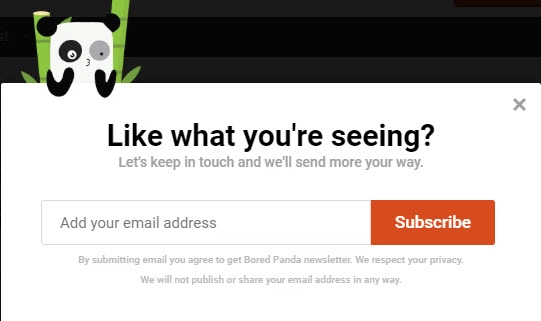
Bored Panda provides a great example of how you can create a process that is attractive to customers and features few steps. The main objective here is to convert users by creating a catchy call to action and providing an easy one-step request for the user to get what they want.
There are several ways to gather new leads and share your solutions with the users, from LinkedIn’s messaging tool to email marketing. This is the case here. Bored Panda mixes its UX design and writing elements to convince people to subscribe to their newsletter programs. Both parties benefit from this action, and the catchy visuals also help persuade the people visiting the website to complete the requested action.
Another UX writing tool that the writers used on this page is explaining that the website won’t publish or share the email address with any party. They also highlight that they respect your privacy and won’t share sensitive information with others. This language makes the user feel more secure and likely to complete the process.
Want to Create the Perfect UX for Your Project?
Mastering UX writing is a challenging endeavor that requires time and dedication. If you seek optimal results when developing your digital solution, hiring a professional company to handle the UX aspect of the project is undoubtedly the wisest choice. With a professional managing this aspect, you can focus on your priorities while having confidence that an expert will craft the best strategy for your content.
GamerSEO professionals have years of experience developing campaigns that target our clients’ main problems and pain points. Whether you need a simple UX microcopy or a complete interface analysis, we have everything you need to succeed with your project.
We work alongside you to ensure the most optimized strategy based on your audience and what you want to achieve. Let’s talk about how our agency can help your business grow.
Time to Start Your UX Writing Efforts
Creating digital solutions, regardless of the type, can be challenging, especially when trying to build the best experience possible for your users and clients. From the layout of your app to the texts you feature when an error occurs, everything impacts this experience and can be a decisive factor in whether they keep using your platform or not.
Good UX writing is indispensable in every step of this thinking process, from the actionable CTAs to how you communicate errors to visitors. If you nail these basic aspects of your app or website’s copy, you drastically increase the chances of your customers becoming loyal to you.
We showed you some main examples to inspire your next user experience design and writing, but there are thousands of others to look at. Researching and looking at other companies is one of the best ways to understand what to do and what not to do when planning this part of the project.
Now that you know everything, it is time to develop your UX writing efforts. Follow the tips above, and you’ll surely have the best results when you show people your digital solution.
Professional writer and designer graduating from Marketing and Advertisement at PUCRS. Lucciano has been working in the industry for over 6 years and, throughout his journey, has accomplished many achievements, including a SET Award in the entrepreneur category. His main goal as a designer and writer is to create marketing that impacts people’s lives through user experience, emotional connection, or any way that generates positive changes. Along with his work, Lucciano shares a passion for video games, especially horror titles, and playing bass.