You’ve likely heard of copywriting before, so let’s draw a comparison between copywriting and UX writing to clarify the distinction between the two.
Copywriting typically involves crafting text aimed at selling something, like ads or promotional content for products or services. For instance, it could be a blog post from a company that subtly promotes its offerings while educating readers. On the other hand, UX writing focuses on the content within a product’s interface, such as the wording on buttons, menus, and screens, designed to enhance user understanding and usability.
But how to do good UX writing? In this article, I will cover the best UX Writing practices to help you achieve your goals and deliver a good experience for users reading your content. Also, you will be able to check some UX writing examples!
How To Do Good UX Writing
While providing universal rules for writing UI text is impossible, offering some general principles can help you create effective UX writing.
Starting With The Basics Of UX Writing Best Practices
Let’s start with the fundamentals. The first three guidelines — clarity, conciseness, and usefulness — are often called the holy triad of UX writing skills. While there are a myriad of UX writing principles to improve upon, for those just starting or who are more technically inclined, achieving perfection can seem like an impossible task.
A solid starting point for all UX writing aspirants is understanding how to write clear, concise, and valuable UI copy. These three basic UX writing principles are the foundation for transforming dense, focused copy into accessible, people-centered designs.
Clarity
Regarding clarity in the UX writing process, the most crucial thing is to avoid assuming that the reader has the exact same knowledge as you do. Many beginners to UX writing learn this the hard way, especially when they use complicated terms and jargon. This often leads to users asking for clarification to understand the message.
Remember: what is clear to you may not be clear to someone else.
Forget the most elaborate terms or phrases that make reading more complex, however creative they may be. Working with words that are part of users’ daily lives is recommended.
There is even an international movement called Plain Language, which argues that web content and services should be accessible to people with different literacy levels.
Conciseness
Time is increasingly scarce for consumers. Few customers are willing to spend more than a minute analyzing an offer. This context makes conciseness highly valued in UX Writing.
The message should immediately present what is most important to the target audience. Work to make your texts succinct and efficient at the same time.
One tip is to dedicate a round of editing to just cutting out unnecessary words. You should use as few words as possible without losing the meaning.
Let’s use the Uber app as an example. The help page, more specifically. It is a perfect example of clarity and conciseness. The topics are easy to read, and you can precisely understand where each one will take you and where you need to click.

© Uber App
Usefulness
Usability is widely used to define the degree of ease people have when using tools, websites, or even products. Its objective is to understand whether the user can locate the functions and understand how everything works quickly, and if a problem is identified, the errors are studied and corrected.
This means helping the user move through the usage flow in a digital product. One way to do this is to review CTAs and other transactional elements and anticipate users’ needs and concerns.
In other words, UX writers must predict what users need before they know it. This is easier said than done, but it’s good to stay one step ahead.
Here is a helpful list of questions users may have:
- Why do you need my phone number?
- Are you going to send me lots of marketing emails?
- Why do you need my credit card if the service is free?
- Is this process safe?
- Is my data secure?
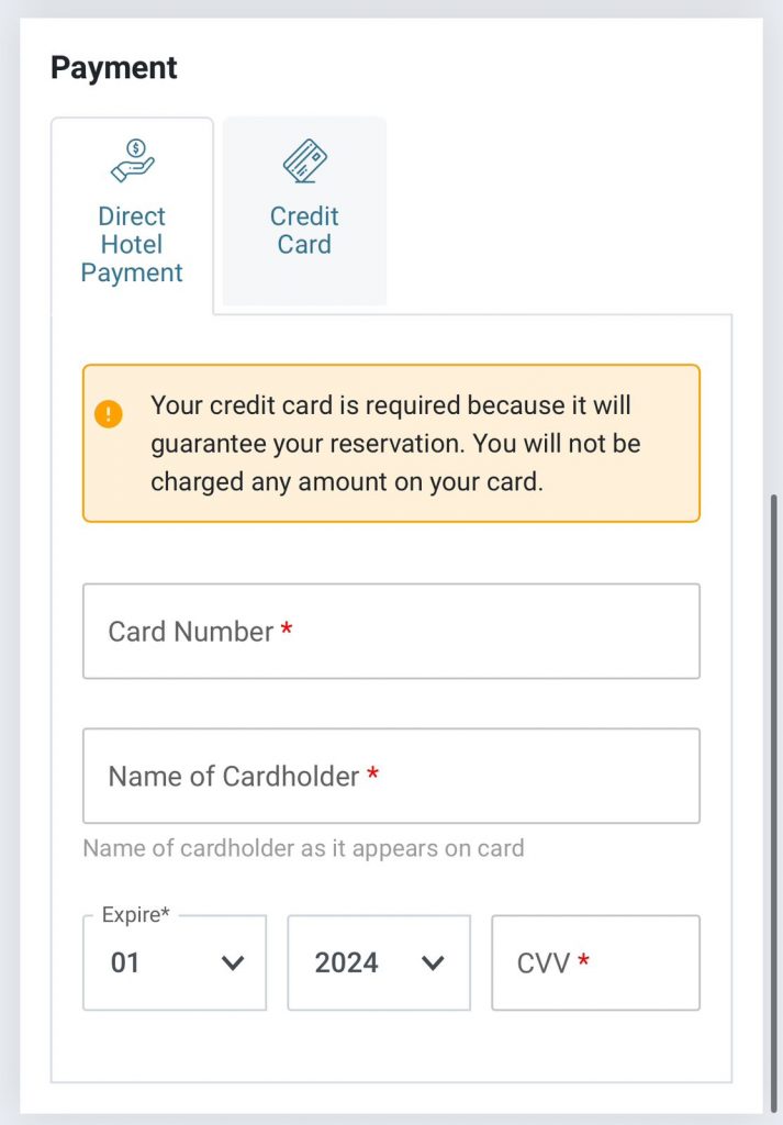
In this example, a hotel requests the person’s card details but clarifies that the person won’t be charged with any amount.
© Apê Smart
Now Let’s Delve Deeper
If your text is already concise, usable, and clear, that’s great! However, even in the best of circumstances, there is always room for improvement.
Now, you will discover how UX Writing can reach new levels of excellence through additional practices.
Adapt The Tone Of Voice
When writing, consider not only the information you are sharing but also how you are expressing it. Conduct user research to understand their reactions to the message, such as confusion or comfort, and what they hope to feel afterward, such as clarity or relief. The tone of voice directly influences users’ perception of your organization, so define it appropriately and keep it consistent across all communication channels.
Another thing to think about is what voice you should use. Most of the time, the way to go is to use an active voice. UX writing focuses on copies that call readers to action. Although passive voice may be appropriate for system operations, active voice is always relevant for user operations.
One last tip for this heading is how to refer to the reader. Think about the brand and what fits better at the moment, and never refer to the user in both the second person and the first person within the same phrase.
Get To Know The Brand You Are Working With
Your UX copy should also reflect not just your tone of voice but your brand identity. How do you want to present yourself to your users? What are your values and personality? How do you differentiate yourself from your competitors? Knowing your brand will help you maintain consistent, authentic, and memorable style of your UX writing.
An easy way to understand your brand’s identity is to imagine it as a person. What would she be like? What is the behavior and character of your brand? Once you’ve established your brand’s personality, writing in this tone should help you streamline your UX writing.
Take Starbucks for example: their voice is friendly and helpful, guiding you through the ordering process while adding a touch of personality.

Consider The Location
Consider cultural and linguistic differences if the product or service is used in different countries or regions. Adapt language and content according to the local context to ensure a relevant user journey.

© Airbnb App
Do User Research
End users directly interact with the interface, so it’s crucial to consider their perspectives when writing UX copy.
A practical approach is to conduct user behavior research during usability testing. Product designers can interact one-on-one with users to uncover behavioral insights during moderated testing. When you collect data and feedback, it helps to analyze from unmoderated tests, and heatmap data from UX writing tools like Hotjar and CrazyEgg can also provide valuable insights.
By allowing users to express their opinions directly, UX writers can access essential information to create an improved user experience.
Organize Content Logically And Prioritize Information Of The Greatest Value
Like in a news text, where the most critical information is presented initially, online content must follow a similar structure. This means essential information must be highlighted immediately, answering the fundamental questions: what, when, how, where, and why. Users can immediately access crucial information without lengthy introductions or descriptions.
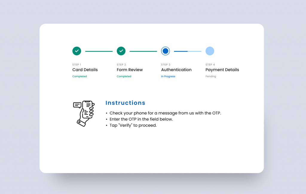
When it comes to guiding users through multi-step processes, like making an online purchase or filling out an order form, it’s essential to create a clear, chronological flow. This means dividing the process into distinct steps and presenting them sequentially, guiding users step by step.
©Tarek Ahmed
Consider The Platforms You Are Working With
Use language that’s consistent with the user’s platform.
Adaptation in UX writing is essential to ensure that the language and terms used are aligned with the user’s platform and context.
A clear example is the difference between interactions on desktop applications and mobile UI. Standard terms for desktop app interactions, like “click,” may not directly apply to mobile platforms like iPhones. Instead, the more appropriate term would be “tap.”
This linguistic adaptation is not just limited to interaction terms but also extends to the style and tone of writing. For example, limited screen space on mobile platforms requires messages to be more concise and direct, while on desktop platforms, there may be more room for more detailed explanations.
Combat User Hesitation
In a digital world full of choices and security concerns, users often hesitate before taking action. Let’s be honest; we constantly see scams on the internet!
This hesitation can result in abandonment of the page or process, harming the conversion rate and user satisfaction.
By carefully choosing the words and phrases that make up buttons, sign-in error messages, pop-ups, and other parts of the user interface, you can increase user trust and eliminate concerns about security and privacy. Show safety to the reader.
Below is an example of a general checkout. You can understand that, even with more words, the checkout is concise and clear. And you feel safe to finish your shopping.

Be Inclusive
Inclusiveness in UX writing ensures that all users feel represented, respected, and capable of using a digital service or product.
In short, you need to adopt a language and approach sensitive to the diversity of users’ identities, skills, and experiences.
This goes beyond avoiding sexist, racist, homophobic, ableist, or any form of discriminatory language and gets into issues of class recognition and providing accessible alternatives for users with visual, hearing, or motor disabilities, such as image descriptions for people who are blind or subtitles for videos for deaf people.
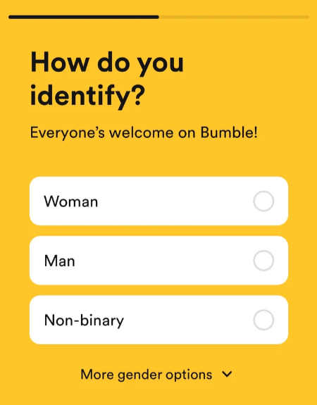
A great example of inclusive UX writing is Bumble, which included Gender Identity Inclusive Options in its signup.
©: UX writing hub
Know How To Handle Error Messages
Even if the user experience is carefully planned, some errors may occur. Error messages are opportunities to utilize UX writing effectively. A good error page informs about the problem, guides the user on the next steps, and maintains brand identity. Clear, concise language and a relaxed tone can transform a frustrating experience into something more positive and informative for the user.
©: UX writing hub
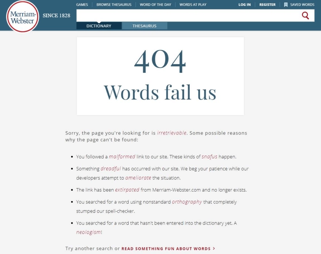
An excellent example is Merriam-Webster’s error page.
On their error page, they tell you about the error and explain what to do next and why it happened. This guides the user on the following steps to take. Additionally, they adopt a relaxed tone, making the experience more pleasant and informative.
The company takes the opportunity to reinforce its identity and value as a dictionary. They offer something relevant to users by defining words – their specialty. This keeps users engaged and shows that the company cares about the user experience, even in moments of frustration.
Highlight The Positive
Adopting positive language plays a crucial role in creating an enriching and encouraging user experience, especially in the context of error messages.
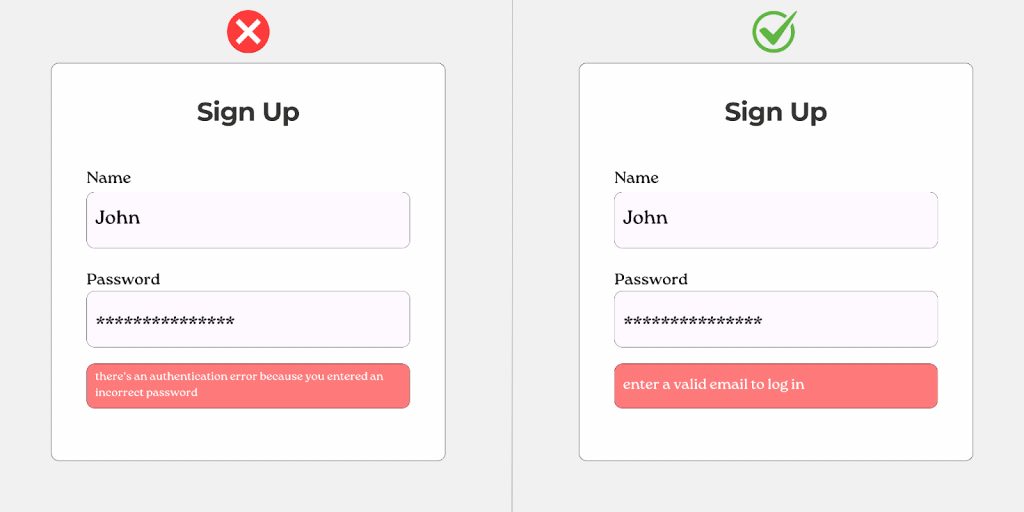
Rather than simply pointing out failures (e.g., “Authentication error due to incorrect password”), it is more effective to shape error messages in a way that guides users toward success (e.g., “Please enter a valid email to continue”).
This positive approach reduces user frustration and motivates them to stay engaged with the product.
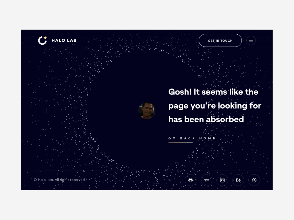
Humor And Entertainment Can Help Your UX Writing
© Halo Lab
Introducing humor into UX writing can be a powerful strategy for creating an emotional connection with users and making the experience more enjoyable and memorable.
By adding touches of humor to error messages or micro-interactions, for example, you can ease user frustration and even turn a negative moment into a positive experience. However, using humor sparingly and considering the context and target audience is essential. A relaxed tone may work well on apps or websites aimed at a young, informal audience but may need to be more appropriate in more serious or professional contexts.
Furthermore, humor must always be clear and accessible to all users, avoiding jokes that could exclude or alienate certain groups. When used well, humor can humanize the interaction between the user and the product, creating a more attractive and captivating experience.
Collaborate With The Design Team
Open communication and a constant exchange of ideas between writers and the design process are crucial to ensuring your brand voice and message are consistent across all user touchpoints.
Additionally, collaboration allows writers to better understand the context and constraints of the design, enabling them to create content that integrates smoothly into the user interface. On the other hand, designers can benefit from writers’ knowledge of language psychology and communication best practices to improve product usability and accessibility.

©: UX writing hub
Here’s an example of a great designer/writer collaboration. Spotify designer team has found a way to tell people where to add their email addresses. The “we saved a spot” copy is fun, giving the individual a sense of importance, and the yellow arrow clarifies things.
Make Content-Heavy Pages Easily Scannable
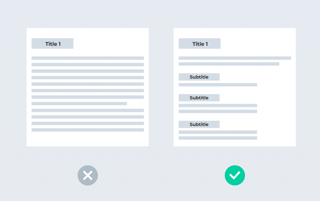
Improving readability with some strategies makes web pages more accessible and attractive to readers. This not only develops a better user experience but also increases the likelihood that users will continue to stay on the site longer, search for additional information, and eventually convert your leads into loyal customers or followers.
© Medium
Non-scannable texts, content that is not navigable and readable quickly with a visual reading, will likely be ignored by readers. For example, rather than instructing users to achieve a goal, you can show a checklist of small tasks that lead users to it. Here are some tips for making your content scannable for visitors:
- Use headings and subheadings whenever you transition to a new topic
- Present content in the form of lists
- Use bold or italics to highlight important information
- Separate very long texts into paragraphs of no more than four lines
Make Links Clear And Give Context
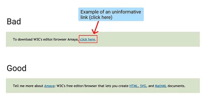
By using clear, descriptive language for links, users are empowered to understand where they will be directed before they even click.

© Medium
This improves usability, providing a more fluid and intuitive experience, and is fundamental to accessibility. For people using screen readers, for example, descriptive links make navigation easier, allowing them to identify relevant content quickly.
© Medium
Additionally, choosing terms relevant to the link destination is beneficial for SEO. Search engines like Google value consistency between link text and landing page content. This helps increase the page’s relevance in the eyes of search algorithms, which can result in better ranking in search results.
Test Your Content Frequently And Revise As Necessary
Testing the usability of your text is just as crucial as testing the design. Like UX Design, UX Writing demands continuous testing to ensure communication effectiveness. In a constantly evolving world, what works today may become obsolete tomorrow.
Therefore, constant review and adaptation are essential to maintain the relevance and effectiveness of your text.
UX Writing Best Practices: Summing It Up
UX writing is crucial in digital product development, as it creates brief and to-the-point texts that lead a user through an interface, thus ensuring that the experience is smooth and intuitive.
In short, the text should follow a consistent brand voice, maintaining cohesion and brand recognition throughout the app. This helps build trust and familiarity with the product. Additionally, system and login errors can disrupt the user experience, so providing clear, helpful messages to guide users in these situations is crucial, reducing frustration and improving retention.
UX writers play a key role in this process, working closely with designers, developers, and other experts to ensure cohesive, consumer-centric enjoyment. They must translate the product’s imaginative and prescient into a copy that resonates with real users, communicating simply and effectively.
Promising UX writing goes beyond correct grammar and spelling. It seeks to understand users’ needs and expectations, communicating with them authentically and engagingly. By providing a consistent brand voice, clear guidance, and helpful messaging, UX writers help create experiences that are intuitive, engaging, and genuinely user-centric.

With a degree in Public Relations and an MBA in Marketing from the best university in Brazil, she brings with her over six years of solid experience as a digital marketing strategy specialist, social media specialist and copywriter. Privately, he is a lover of traveling and the world of cinema.

