Running paid ads on search engines or social media platforms is undoubtedly one of the best contemporary marketing strategies. Whether on Google Ads, Facebook Ads, or any other platform, we can reach numerous potential customers.
But for these users to complete the sales funnel and finish the purchase, several aspects need to be planned. One of them is your PPC landing pages.
A good ad makes people click them, but thanks to the dedicated landing pages, they keep navigating through your website and completing the purchase. If you don’t know how to create a dedicated PPC landing page, don’t worry. This article is for you.
We will show you how to create the perfect landing page for your PPC campaigns. Follow all steps to ensure successful results and a visually stunning web page.
What Is a PPC Landing Page
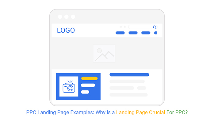
Every time you click a paid ad, you’re automatically redirected to a web page. This website you’re taken to is called the landing page.
It can either be the main page of your website or a dedicated PPC landing page regarding a special sale or anything like that. Every time you create a PPC ad, the platform will ask you for a URL to which the potential customers will be taken. This URL is the landing page of your marketing campaign.
The ad and landing page complement each other to make the user complete the sales funnel and become a customer. This is why every aspect of both parts needs to be perfectly aligned.
Why Having a Linked Landing Page Is Indispensable
Even though making people click on your ad might look like the most challenging part, it is not the only one. After making them want to learn more about your product or service, your task is to convince them to buy it, and the way to do it is through the landing page.
Creating a good experience for the users is the key to turning them into recurrent customers, and that’s why every aspect needs to be correctly planned, from the PPC landing page design to the CTA. The landing page content is as important as the ad you’re creating.
If you don’t have a proper page linked to your PPC campaigns, the users might give up purchasing your product or lose interest in it depending on the number of steps necessary.
What Should Be Included for Effective Landing Pages
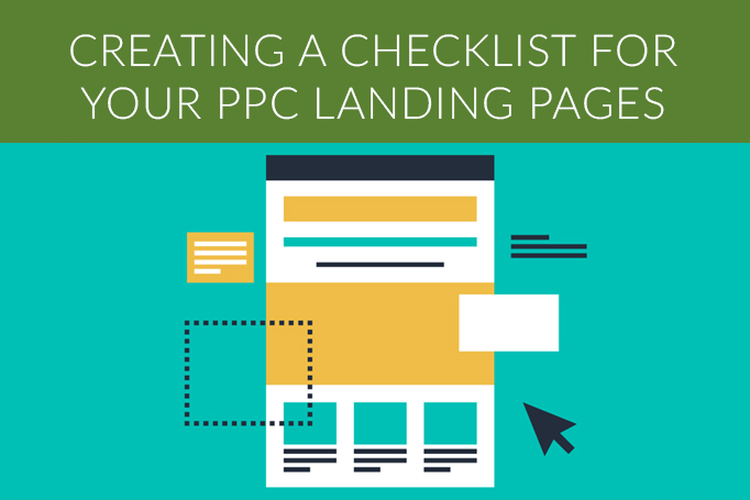
Now it’s time to see some of the main elements featured on a web page that can help you convince the potential buyer to complete the operation. Make sure to take a look at each element to see how they impact your business and how you can perfect them for your next campaign. Here are the main features for a perfect landing page experience.
Clear Explanation of the Product or Service
One of the first things people will notice when redirected to a dedicated web page is the explanation of the product or service they clicked on. If they interact with your search ad, it means they want to know more about it, and that’s why this is one of the most essential landing page elements.
The explanation should not be too extensive since it can make people lose interest in acquiring it. Instead, make sure to create quality text featuring all the necessary information in a summarized text.
Catchy Headline
Sometimes, your landing page will also feature a headline. If this is the case, make sure this headline is attractive and directly related to what’s on the ad.
This way, the person notices the landing page corresponds to the ad they clicked on. Your headlines should be straight to the point and short for better understanding.
It is similar to doing ad copy for a blog post or PPC advertising. The clearer you get, the higher the chances of convincing the target audience to purchase from you.
Good Call-to-Action
Not only your headlines need to be attractive, but also your CTA. The best PPC landing pages feature a catchy CTA to convince potential customers to complete all the steps to acquire what’s being announced in the Google ad or social media announcement.
Use imperative verbs since they will most likely help create landing pages that convert. The main objective for the CTA in successful PPC landing pages is to convince them that they need the product or service. It should prompt them to take action immediately, whether that means making a purchase, subscribing, or anything else.
Clear Communication
This will impact all the items above. Every piece of text must be crystal clear when creating landing pages.
People need to read your texts and have no doubts about what you’re offering or any other important information. Make sure to use simple language that is straight to the point, whether when creating your headlines, CTA, or any element of the page.
This also applies to the ad copy you create. The text featured in both parts of the conversion process are key elements and should not be extensive.
Creating boring texts increases the chances of users giving up on the purchase or not understanding clearly how it can solve their problems. Create different versions of your texts and test them to see which ones perform better in your paid traffic ad and landing page.
Social Proof and Reviews
Another action that highly contributes to creating high-converting PPC landing pages is including social proof and user reviews on the product page. For example, if you sell a tech product used by big companies like Google and Amazon, featuring this on your page is quality social proof and can be the key to convincing a user.
Along with these companies that use the product, you should also include reviews from users who purchased it. Doing this gives credibility to what you sell and helps increase your Google Ads quality score when marketing on the search engine.
PPC Landing Page Best Practices
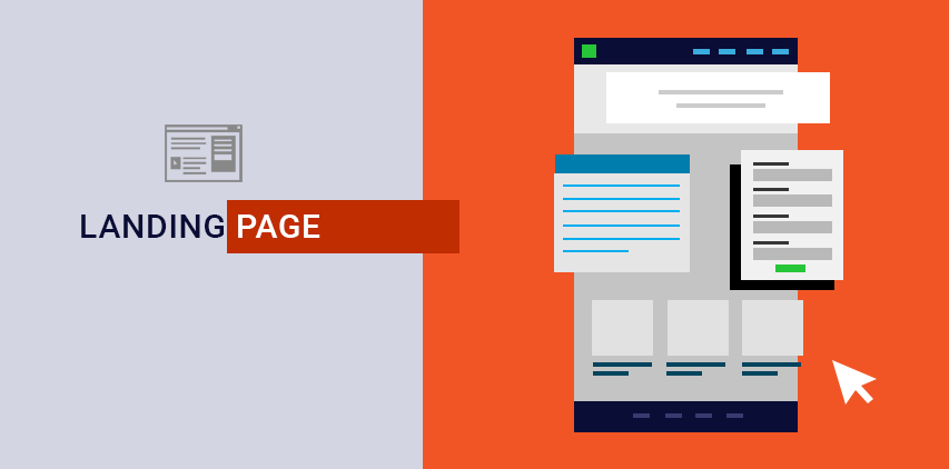
Now it’s time to see all the best practices you can use to create the perfect landing page for your website or product. Make sure to follow them, and you’ll notice a drastic improvement in your sales and how long users stay on your website before leaving it.
But for these practices to work, having a solid strategy and understanding your goal is indispensable. This way, you can better tell how each of the following tips can impact your business.
Here are some of the best practices for pay-per-click landing pages:
Always Optimize Your Page Speed
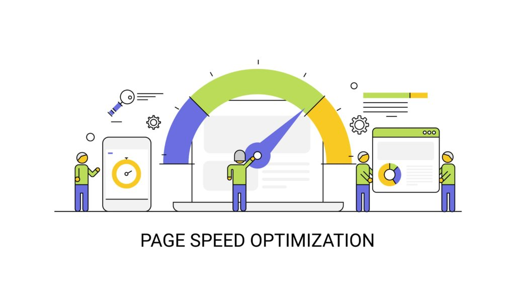
One of the most important practices is to optimize the speed of your PPC ads landing pages. Whether you’re doing paid advertising or gathering organic traffic through SEO, this is vital since it helps you achieve a drastically better Google Ads score.
Not only that, but the page load speed is a vital factor in the decision-making process, and long loading screens might make people give up on purchasing your service or product. Optimized pages are directly related to better conversion rates.
Your target customer’s entire experience will impact the sales funnel, and optimization is not exclusive to a sales page. You should worry about it regardless of whether it’s a page for accessing your product catalog or a sign-up form for receiving a newsletter. Responsive websites have much higher scores in Google Analytics or any other search engine.
Take Care of Your Landing Page Layout
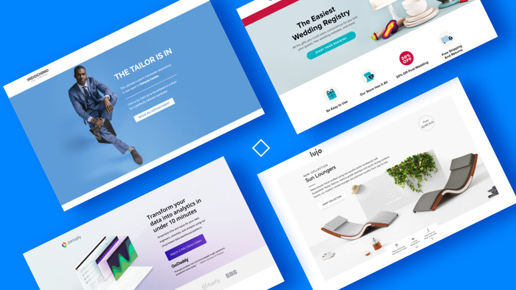
This is the best practice if you want to keep users on your website for as long as possible. Creating a good layout for your page makes it prettier and visually appealing and allows people to locate what they’re looking for more easily.
For achieving the best look possible, many business owners use a landing page builder that already features layout presets and options. Everything needs to be aligned and follow the visual ID from your company.
With all the elements properly connected and the web page loading quickly, converting visitors and making them complete the sales funnel is way easier. To know what to feature in the layout and the most important elements, make sure to understand your target customers and what they want to see.
Be careful when using internet templates since you can end up with a generic page. Analyze your elements and spend some time thinking about how to arrange them so your website looks unique and good for potential customers to easily locate what they are looking for. A poorly designed PPC landing page can directly contribute to a lower sales volume.
Align CTA and Ad Headline
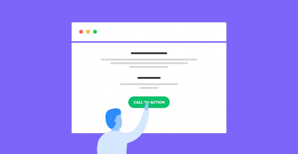
Another characteristic of a good landing page is the alignment of your information. Whether your objective is lead generation, sales, or any other, the information featured on the web page needs to be consistent and aligned.
If you create ad spend talking about your product, it is vital that the landing page’s content is also about it and your call-to-action aligns with it, like “buy now” or “click here to solve your problems.” Along with that, make sure to highlight the CTA on the page. You need to strategically position it to generate more conversions and clicks.
When targeting users, your marketing funnel must follow a logical order, which also applies to your website. The sequence of information needs to have logic to work. The customer journey on the web page usually follows the order: Headline > Ad Copy > CTA.
Create a Separate Mobile Landing Page Design

We know that a website is displayed drastically differently on mobile devices, which is why it is important to worry not only about how it will look on the desktop but also on other device types. Most website-building platforms allow you to create separate layouts for both desktop and mobile.
Doing this is extremely important since, depending on the mobile result, it can annoy people searching for specific information and not finding it where it should be. Most people use mobile devices for web navigation and online purchases, so creating this dedicated layout is indispensable for a good conversion rate.
This practice becomes even more crucial when creating PPC campaigns on social media. More than 80% of social media users use mobile devices to navigate the platforms.
Consequently, it is the device they’ll use to click on your ad. If you don’t have good mobile optimization on your landing page, your conversion data will be drastically low.
Create Short Forms
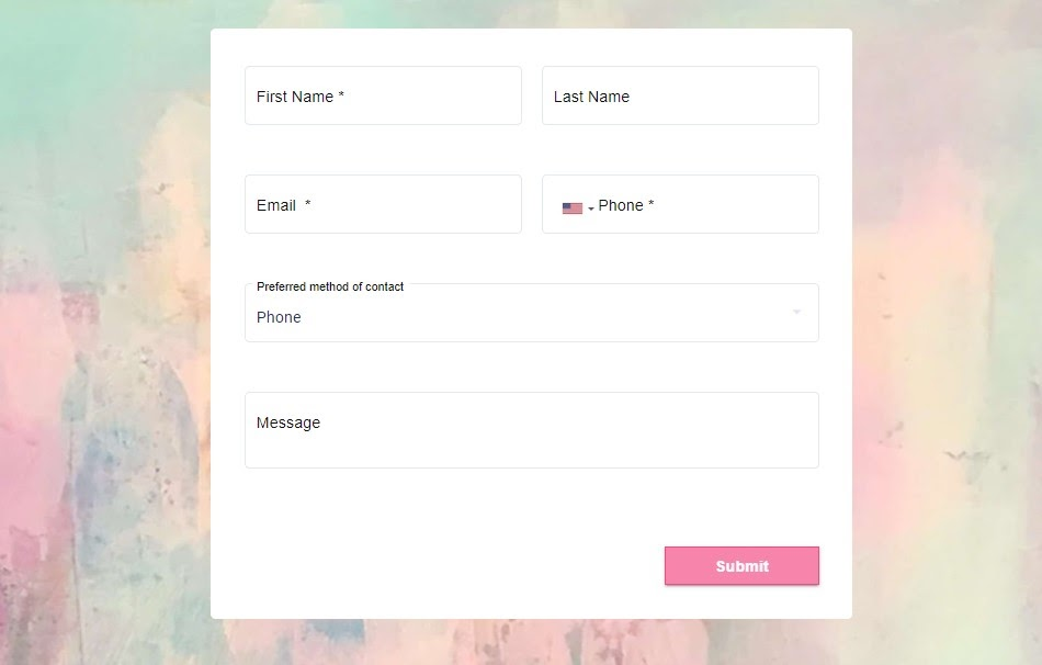
Creating short forms is another valuable tip for your PPC campaign and its landing page. The more information required and the longer it takes, the higher the chances of a visitor converting into a customer.
When creating forms, make sure only to ask for strictly necessary information. If they notice the form is extensive and will take time to fill, they will likely give up, and the sale won’t be concluded.
This is most common on forms but not exclusive to them. If you create numerous steps for the user to purchase a service or product, it is less likely for them to complete the operation.
Use Compressed Images
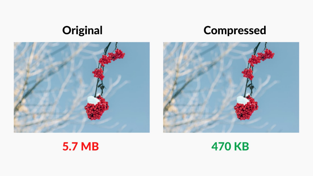
Another great way to optimize your website and improve the landing page is by compressing images used for a product or any other website element. This action can be done either when editing the image or online through dedicated websites.
Be careful not to compress the images too much since this can decrease their quality and resolution. Using compression is also an excellent tip for SEO and can drastically improve your score on search engines.
This can be used for all types of websites, not being limited to product pages. Many businesses forget to do this action, which results in slow websites where images take even minutes to load. A responsive design is one of the critical elements of a good landing page, and optimization is the way to achieve it.
Create Single-Purpose Pages
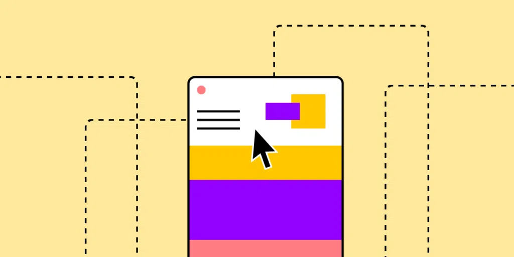
When designing a web page, creating pages that follow a single purpose is highly recommended. For example, if it’s a page presenting the product, don’t use it for other purposes, like talking about the company or presenting other services. This will help your landing page look more “clean” and make it easier for potential buyers to understand the information contained.
Create Emotional Connection

One of the most critical factors for completing a sale is the emotional connection you create with your customers. Create situations they can relate to and show how you can solve their problems through creative ad copy.
Creating emotional language doesn’t mean exaggerating the writing. You can do it while keeping it simple so they can relate and easily understand what the text is about.
You can also take a look at your competitors and what specific phrases they use to connect with their audience. With this, you can generate insights for writing content and engage more users with your brand.
PPC Landing Page Examples
Now it’s time to see some landing page examples you can use to generate insights and ideas on how to create the best layout for your PPC page. Whether you want to lower the cost-per-click or increase sales, the landing page you insert greatly impacts its results.
Make sure to take a look at each example below to see how they can help you create better websites. Here are the main ones:
Monday.com
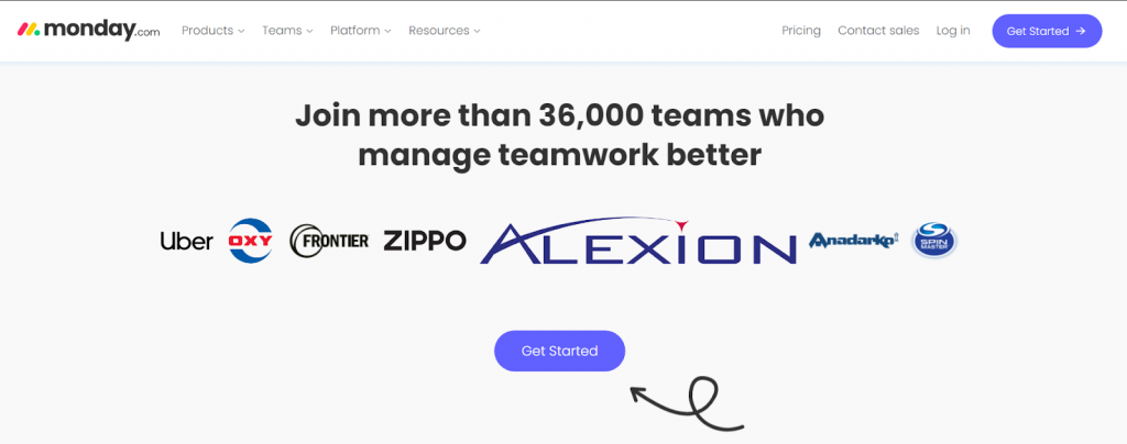
Monday is one of the best examples of how to feature social proof on your home page and make it feel natural. We also mentioned how showing examples of big companies that use your solution is one of the PPC best practices, and Monday shows it perfectly.
By seeing that companies like Uber use their software for working, it is likely that business owners will also want to use the tool for their tasks.
Apple
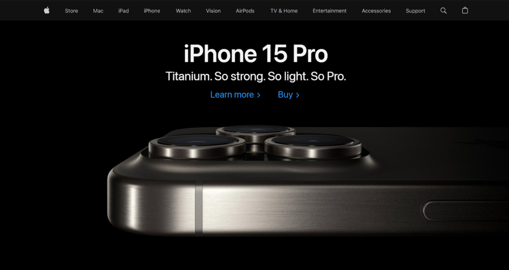
Another great example of a good landing page is Apple’s website. Here, you notice that compressing images and making the website extra responsive doesn’t mean sacrificing quality.
Every picture from Apple’s products features a high quality where you can see every detail from it, even when compressed. Moreover, Apple knows well how to create single-purpose pages. Every tab from their website is dedicated to a unique purpose, whether to describe the product you selected or to list all the options of a specific product category.
Apple also creates multiple landing pages for its PPC ads. Instead of always being redirected to the main page, you’ll be taken specifically to the product you clicked on.
Amazon Prime
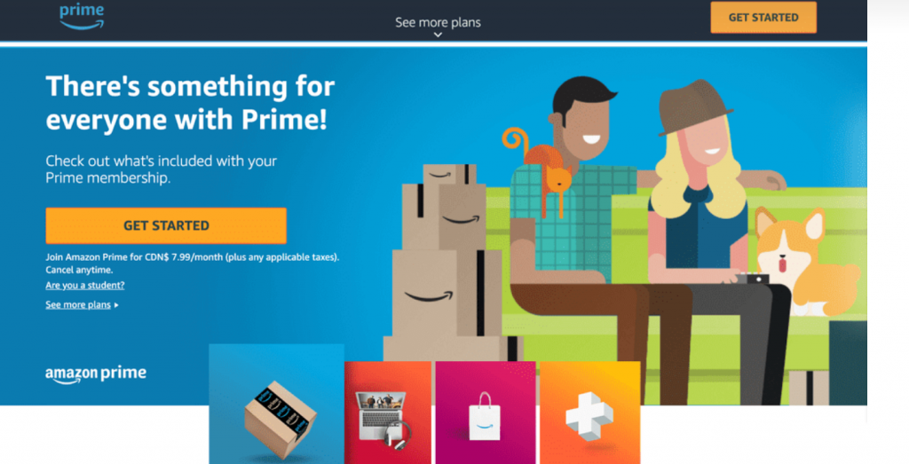
Another great example of a landing page for paid search ads is Amazon Prime’s benefits page. Once you click on the ad, it will take you to a website showing all the benefits of signing up for their subscription service. This website works perfectly for numerous reasons.
The first one is that it clearly presents the users with the benefits of signing up for it and how these perks can solve their problems.
The website is also extremely responsive, and its form for acquiring prime is considerably small. This way, they decrease the chances of people giving up on the subscription.
Netflix
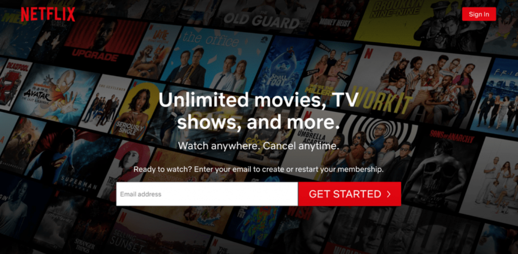
Netflix follows a similar strategy to Prime but with a clever twist. Instead of asking for a short form, like Amazon, it asks for only one piece of information for subscribing to the platform. The difference is that the other relevant information will be requested on another page.
By asking for only one piece of information, it is more likely for the user to fill it in and click on “get started.”
The rest of the landing page follows the same format as Prime. It presents the main advantages of the subscription and how it is the best option for users looking for entertainment.
Consider Working With a Professional Agency
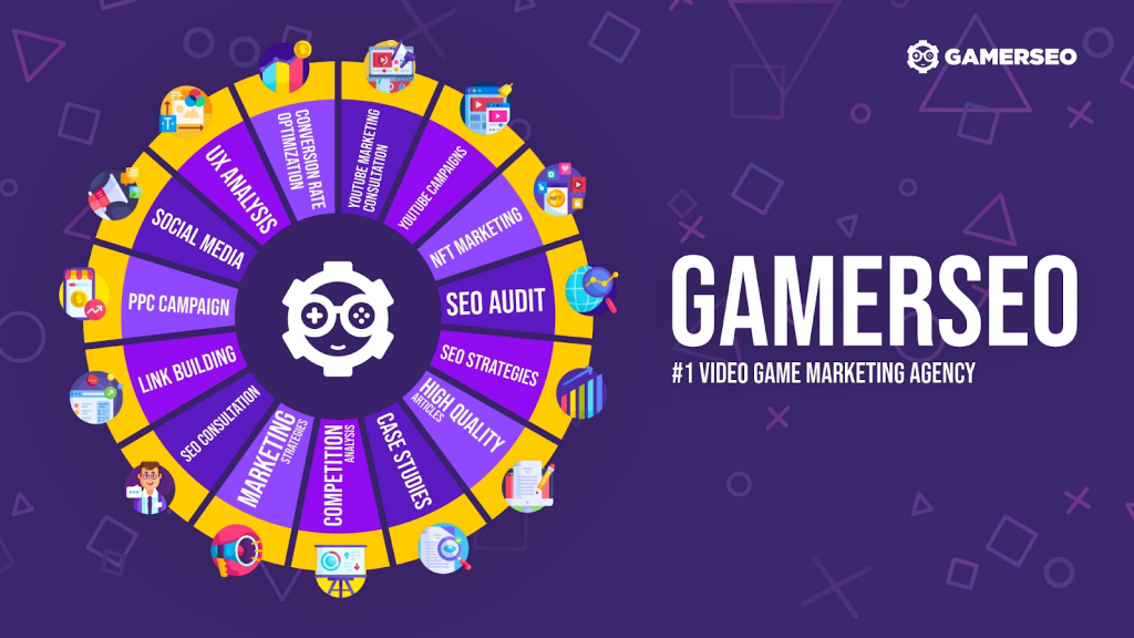
Creating an eye-catching landing page with an optimized design is not easy, so hiring a professional company to do it is vital. The web page itself and other aspects of your PPC campaign, when planned by professionals, have much higher chances of success.
At GamerSEO, we have the best professionals on the market with years of experience. Together, we can create the perfect landing page for your paid search efforts to reach much more positive results.
Join the GamerSEO family, and let’s create a strategy completely dedicated to your main goals, whether you want to generate more clicks on search results or increase your online sales. We offer various services to ensure your business reaches another level of success.
Conclusion on PPC Landing Pages
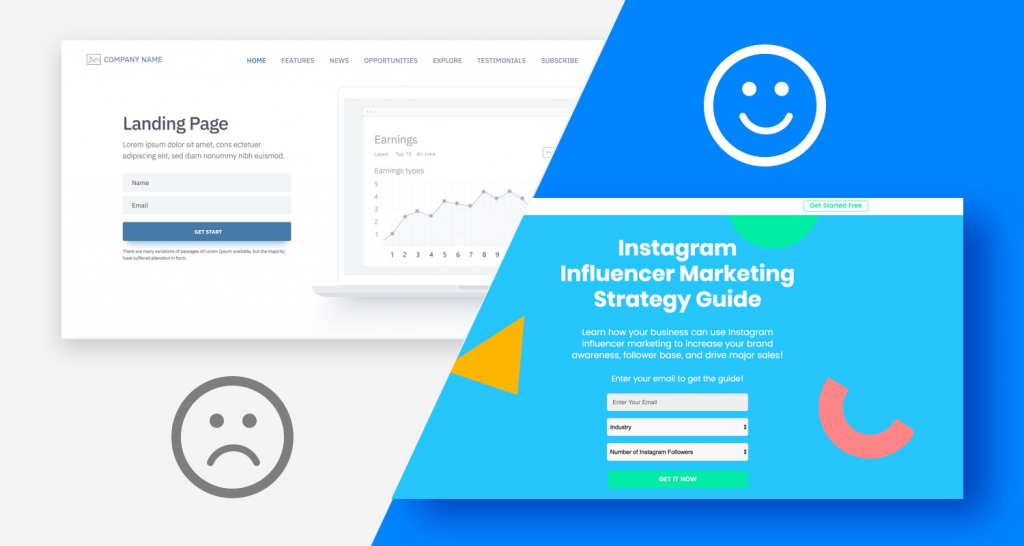
No doubt, the landing page has an enormous impact on your PPC ads and their performance. From the language used to the number of clicks you have to make, every aspect impacts the decision-making process and your conversions’ effectiveness.
Every aspect of your strategy must be aligned and communicate with each other. This way, you create a much more optimized sales funnel that helps you achieve your objective, regardless of what it is.
Now that you know everything you need about landing page best practices, it is time to start creating your web pages. Follow each step and tip carefully, and you’ll instantly notice the growth of your business and its PPC campaigns.

A PPC specialist who started with organic social media. For several years, the core of his activities are:- Google Ads, Microsoft Ads, Meta Ads, TikTok Ads, Twitter Ads, Linkedin Ads. He has led campaigns with a global reach, e.g. for FootballTeam, G2A, ETOTO, as well as many smaller campaigns in the sports, construction and financial industries. Has full focus on ROAS. Privately, a fan of football, history of wars and Star Wars.

