Facebook is one of the most powerful advertising platforms. With its vast user base and targeting capabilities, it offers you multiple opportunities to showcase your products and services.
This article centers on the best Facebook ad examples across different formats. From captivating image ads to engaging video content, these examples provide invaluable insights into effective ad creatives.
Ready to find some inspiration? Find here all you need.
Facebook Image Ad Examples
Among the best Facebook ad examples, we have the image ad. This is the simplest way to show a product, and combined with a great resolution, copy, description, and call-to-action, you can elevate your ad’s performance and generate leads and conversions.
Let’s take a look at some of the best image ad examples.
1. Ascension

This ad got 411 email subscribers and multiple interactions. But why is this a successful ad?
Ascension knows its specific target audience well and presents this ad with a simple message. It uses an appealing ad image and clear text and highlights the game with the phrase “award-winning.”
Additionally, it incorporates a “Learn More” call-to-action, teasing its fanbase to interact with the landing page.
2. Hubble
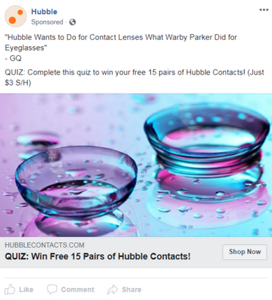
Hubble’s ad incorporates three clever strategies.
First, they leverage a quote from a well-known brand, GQ, to generate credibility for their contact lenses through social proof.
Rather than directing the viewers to a purchase page, they guide them to a quiz, creating a feeling of a personalized buying experience.
Lastly, to make an appealing deal, they offer an incentive: complete the quiz and receive 15 pairs of contact lenses for free.
3. TechCrunch
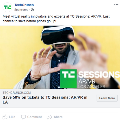
TechCrunch hosts numerous events and utilizes Facebook ads to promote ticket sales.
This particular ad has two tactics to prompt swift action. First, it highlights an imminent price increase, and second, it emphasizes a current 50% discount on tickets, a clear incentive to their potential customers.
4. Deliverance

This ad targets a particular niche with a unique theme: epic Christian fantasy dungeon crawler, which sets it apart from other board games. The distinctive theme could attract those interested in religious and fantasy topics.
The ad image centers on a protagonist with a detailed design and high-quality resolution. It also has an effective call-to-action, inviting Facebook users to get more information about the game, leading to more interactions.
5. Kanjozoku Game

The ad starts with engaging content addressing the fantasy many gamers seek to experience: the thrill of secret racing. Also, by featuring the Steam logo, the ad increases credibility, and the players immediately know where they can purchase and play the game.
The combination of engaging visuals, clear CTA, targeted messaging, and platform clarity make this Facebook ad effective in capturing the attention of potential gamers and prompting them to take action.
6. Spotify

Spotify is a brand renowned for its outstanding Facebook campaigns. One example is this ad, which features a high-quality and captivating image coupled with straightforward copy and the brand’s logo, enhancing its credibility.
Furthermore, it has a direct CTA and highlights a compelling offer: listening to your favorite music for FREE. This enticing word is emphasized in the headline, image, and description, likely grabbing many user’s attention.
Facebook Video Ad Examples
It is well known that Facebook’s users are more attracted to videos than images. This format helps you to demonstrate in an appealing way how your products work, to showcase a story about your product, an animation, and much more.
Below, you’ll see some of the best Facebook ad examples related to video ads.
1. Glossier
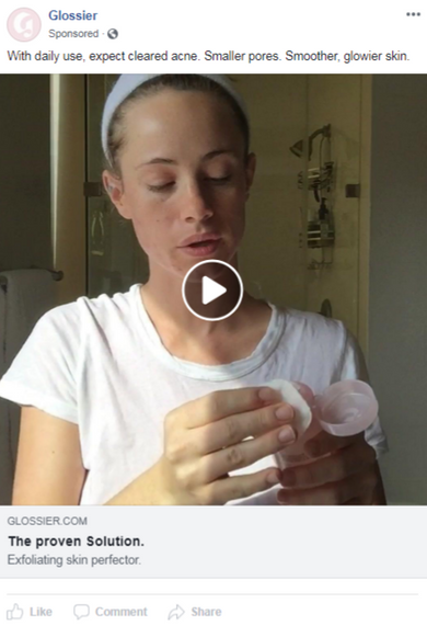
Glossier is a company that provides online beauty and skincare solutions.
The principal strategy implemented by this brand is the collaboration with influencers, who show the product’s features through video ads.
This enhances the brand credibility, and incorporating this strategy influences the potential customers to buy the products.
Additionally, the ad copy is short but clear and highlights the benefits of using Glossier products.
2. Quip
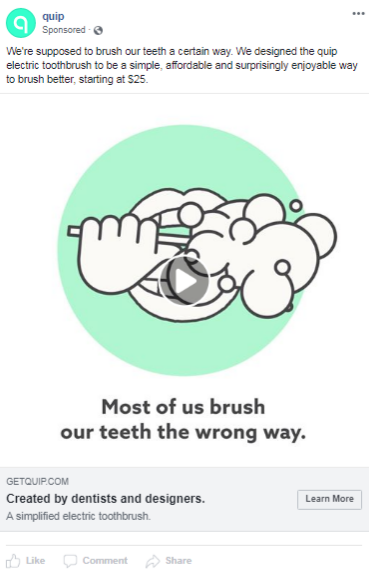
The first technique Quip implements in this ad is telling you that you’re brushing your teeth the wrong way, basically saying that with their toothbrush, you can brush your teeth better.
The ad copy further enumerates other benefits like “simple, affordable, and enjoyable.” Additionally, in the description, they incorporate a credible and reliable copy, highlighting their toothbrushes are crafted by professionals.
3. M. Gemi
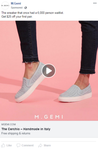
The notable quality of this Facebook video ad is the promotions. The copy mentions a $25 discount and free shipping and returns. This incentivizes potential customers to visit the store and get more than one pair of shoes.
The ad also mentions that this product was sold out, meaning that the viewers can miss this deal if they don’t get a pair of shoes immediately.
4. Frank And Oak
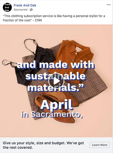
Frank and Oak, a clothing subscription brand, enhanced their ad’s trustworthiness by pairing it with a CNN headline.
They also incorporate a testimonial overlay on the video content, being an example of an intelligent use of available ad space.
In the description, they offer to help customers by gathering information about their budget and size, creating a personalized approach to generate more leads.
With this data, they can eventually craft a retargeting ad for those clients who didn’t purchase.
5. Helix Sleep
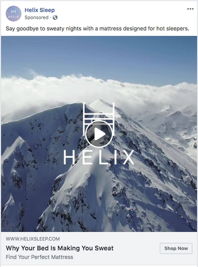
Helix Sleep uses indirect messages to sell its mattresses. The best characteristic of this Facebook ad is the video content itself, introducing snowy mountains referring to cold mattresses and a poor sleeping experience.
This ad example is well targeted only to hot sleepers, creating a specific group audience and increasing the conversions, also including a direct call-to-action with the “Shop Now” button.
6. Xbox
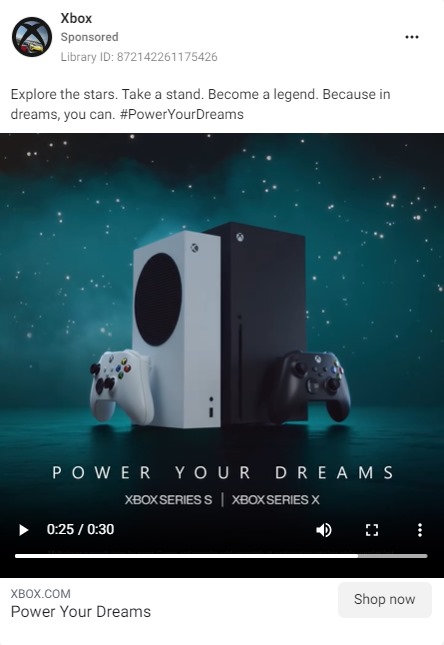
This is another Facebook ad example that demonstrates that with a short copy, compelling story, and high-quality video, you can create successful campaigns.
Saying phrases like “Power Your Dreams,” Xbox uses philosophical words to get into the viewer’s psyche, offering an experience more than a product.
This strategic approach attracts potential customers who identify with those words.
Facebook Carousel Ad Examples
A carousel is a great form to showcase a sequence of your products and encourage your audience to interact with your Facebook ad. This format demonstrates several features, a step-by-step guide, gifs, videos and images, and more.
Check the best Facebook ad examples below.
1. Fender
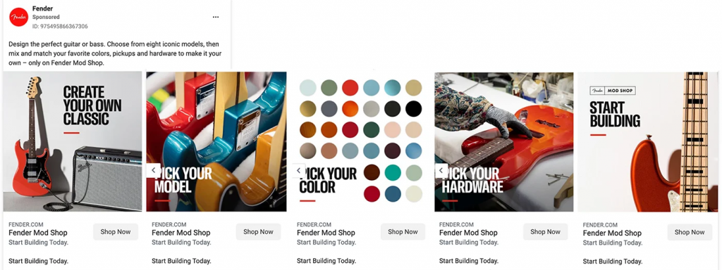
This Fender Facebook advertising brilliantly creates a carousel to demonstrate how easily customers can customize their guitars.
With vibrant images, concise ad copy, and a step-by-step-like process, this Facebook ad example showcases the design journey to create “your own classic” guitar.
Each call-to-action guides the client to the same destination on Fender’s landing page, allowing them to start designing at any point during their ad interaction.
2. John Lewis & Partners
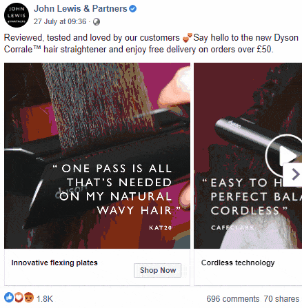
This Facebook ad exemplifies a product-centric approach. Short videos maintain brevity while incorporating women’s testimonials, accentuating the product’s reliability.
Featuring “Dyson” in close-up shots, the ad highlights the brand’s power.
Every carousel card mentions a standout feature next to a direct call-to-action. It also offers free delivery, incentivizing the clients to buy more than one product.
All of these strategies mentioned above turned this advertising into a great Facebook ad example.
3. Epson
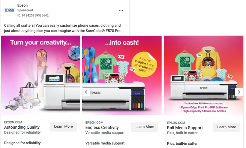
This is a concise Facebook ad, leveraging vivid graphics and value-driven ad copy to capture the viewer’s attention, meaning that not all carousels should be extended.
The ad’s intentional sequencing of text and images in the first two cards is a great strategy to lead the target audience to interact with the carousel and know more about the product.
Additionally, just like every successful Facebook advertising, it incorporates a feature in every slide, a direct CTA, and a short but clear copy.
4. BarkBox

BarkBox, thinking out-of-the-box, created this Facebook ad ingeniously combining the carousel with humor. It involves a creative way to promote their products, where the viewers have to swipe the ad to see how long the puppy is.
Moreover, every card has the same CTA and almost the exact ad copy by mentioning “FREE” repetitively, the favorite word of every potential client.
5. Feather
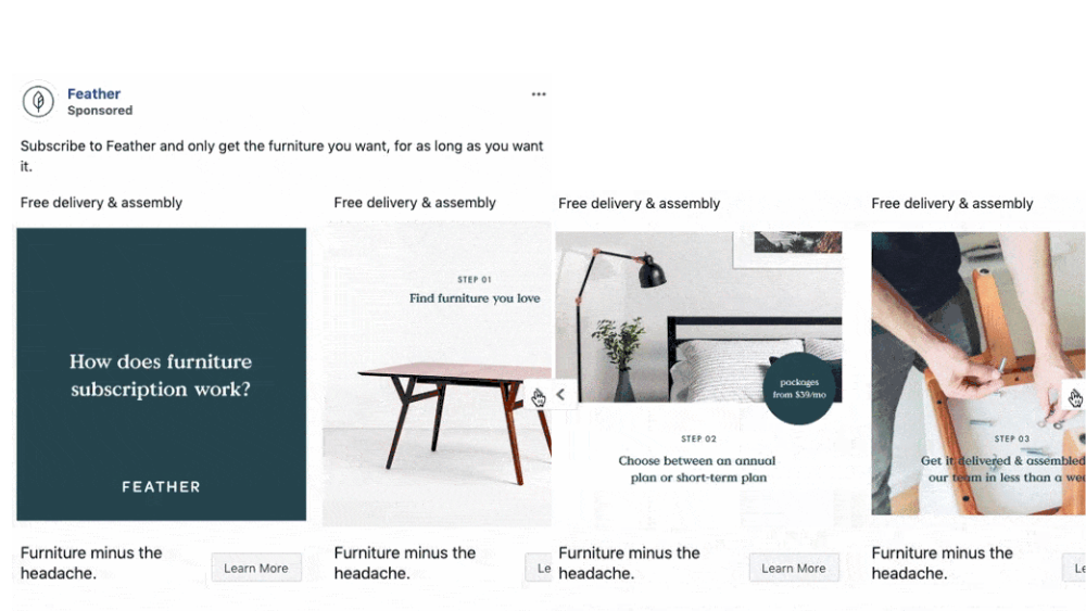
The first image in every carousel ad is crucial to generate attention.
How did Feather accomplish this?
It commences with an intriguing query, piquing the viewer’s interest, and strategically disperses the answer across the carousel with a step-by-step guide. This design ensures that potential buyers remain engaged.
This Facebook ad example uses minimalist images with concise copy, resembling the brand’s aesthetic, and incorporates an incentive offering free delivery and assembly.
6. UNIQLO USA
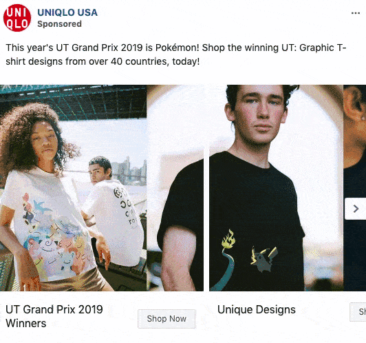
This carousel ad uses a broad, collage-like design to gently motivate people to swipe through it.
By putting ‘UT Grand Prix 2019 Winners’ as the main description on the first image, it immediately tells viewers that these are not just ordinary graphic t-shirts but ones that have won prizes.
People naturally like to have the best things, so it makes sense to highlight the awards your product has received.
Facebook Collection Ad Examples
You can find this format in the Facebook news feed, which includes a central image or video followed by three smaller images.
It showcases multiple features in one ad to target your audience and have a broader view of your products and services.
As soon as they tap on the collection ad, they’ll be taken to a full-screen landing page, driving interest, engagement, and intent.
Let’s delve into successful Facebook ad examples.
1. GameStop
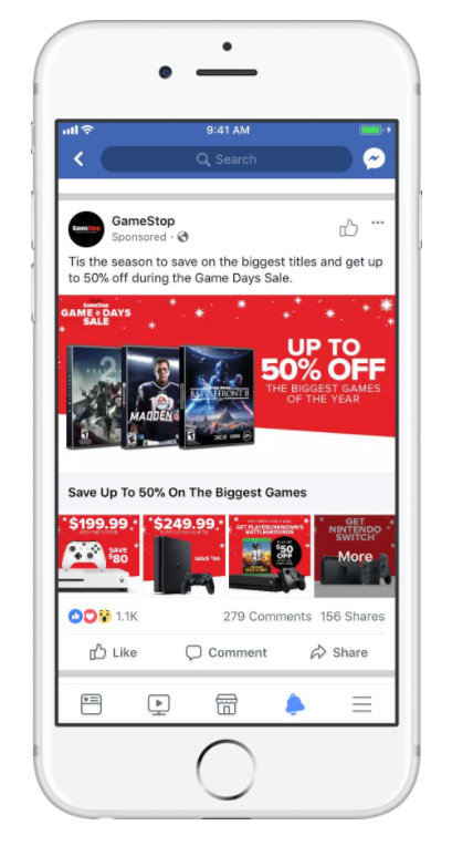
GameStop uses the collection format to showcase several products, from video games to consoles. At first sight, you can notice that the images impact and attract the targeted audience with vibrant colors and large fonts.
The ad copy is highlighted with a red background, making it easy to read, and the copywriting also mentions several times a clear promotion, a 50% discount.
Lastly, GameStop uses well-known brands, like PlayStation and Nintendo Switch, increasing the trustworthiness and credibility of the products among gamer clients.
2. Corkcicle
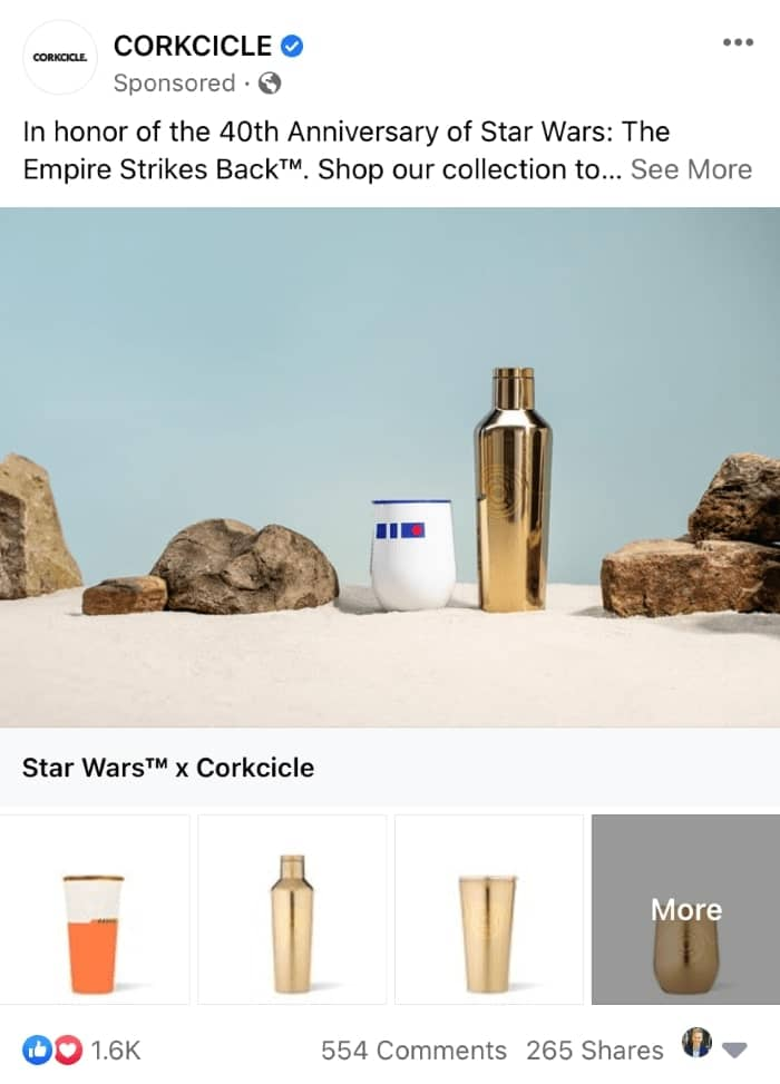
The strategy used in this Facebook ad example is collaborating with a worldwide brand: Star Wars.
The featured image resembles two recognizable characters in an environment similar to the movie, and Corkcicle incorporates four simple pictures to not overload the collection ad.
This Facebook ad is well targeted to a specific group, a crucial strategy to generate leads and conversions to your brand.
3. Audi
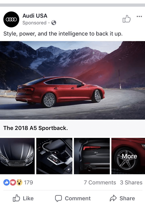
The principal characteristic of this ad is the high-quality imagery. The main image captures the car in a scenic environment, implying performance in various terrains and creating an aspirational feel.
The smaller images below provide close-up views highlighting the car’s features, allowing the viewers to appreciate the design elements.
This Facebook ad example has a brand presence by placing the Audi logo, emphasizing luxury, and has a clear message by mentioning the car’s attributes.
It tells the viewer that the car isn’t just about looks, it also possesses power and smart features.
4. Lunya
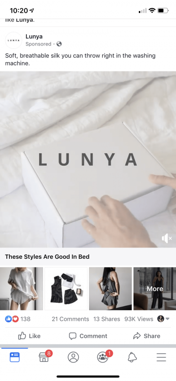
This Facebook ad example combines a feature video with images. It starts with an unboxing video which shows the quality of the clothes.
Once the ad catches the viewer’s attention, they can be taken to review the rest of the clothing collection by introducing smaller images with models wearing pajamas.
The description is simple but clearly showcases the clothes won’t be damaged easily, a characteristic that differentiates Lunya from its competitors.
5. Clock And Colours
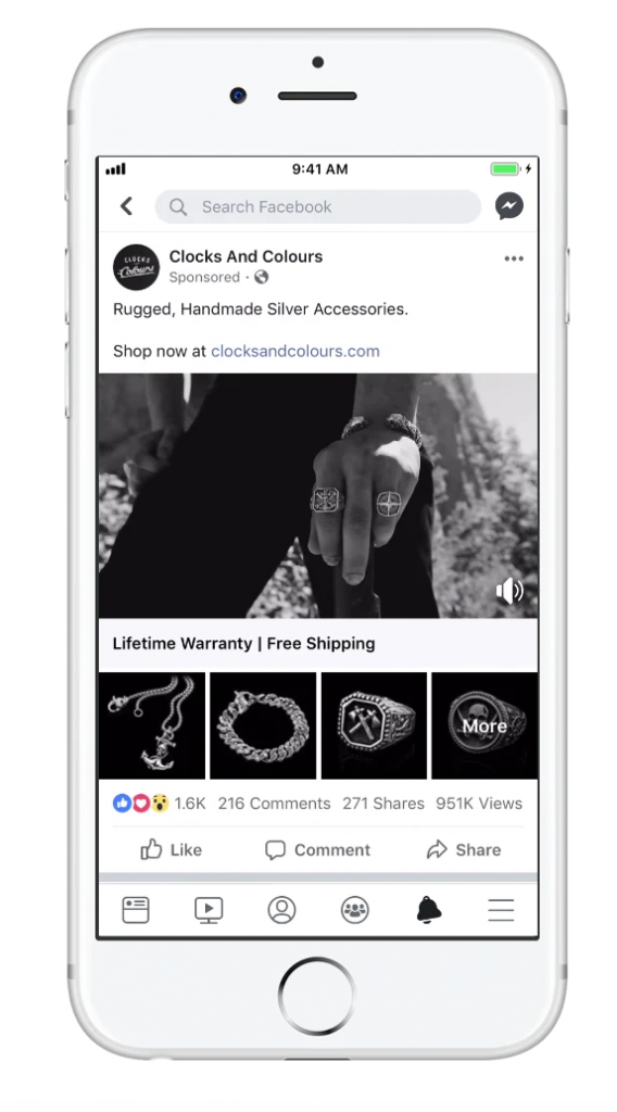
The Clock And Colours Facebook ad employs a combination of compelling, monochromatic, and high-quality images. The headline emphasizes unique points and includes a direct “Shop now” call-to-action with the brand’s external link.
Incorporating prominent value propositions like “Lifetime Warranty” and “Free Shipping,” convert this Facebook ad into a successful campaign that captures viewer’s attention and resonates with them.
Facebook Stories Ad Examples
The perfect way to showcase products on mobile devices. Facebook stories introduce vertical and visual advertisements that combine videos, images, copy, and more.
You can use this format to capture the customer’s attention at once. Since stories last just a few seconds, viewers are more likely to watch the entire advertisement.
Let’s delve into some of the best stories and examples.
1. Shopify Plus
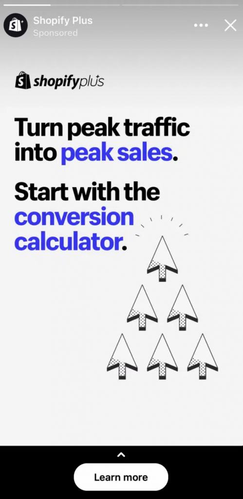
This Facebook ad uses a simple image with large fonts to make the ad readable on mobiles. It highlights the essential words with a bright blue and incorporates a clear CTA.
Shopify, more than selling their service, offers a solution to “peak sales” and tells you where to start. This strategy will compel viewers who are having issues with their own brands.
2. Michael Hyatt

The usage of contrast is the standout point in this Facebook ad. The image showcased is remarkable and employs a generous use of white letters to contrast the background.
The ad’s copy effectively conveys a compelling value proposition, and the design choice guides the viewer’s eye through the ad, leading them straight to sign-up.
3. Lumen
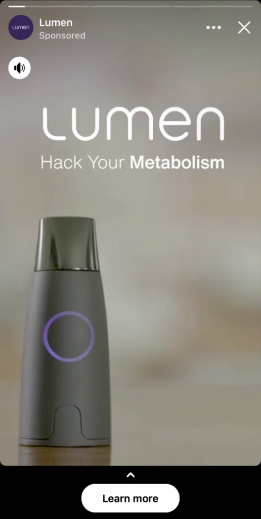
With a short video and concise copy, this full-screen Facebook ad showcases a product, mentioning its benefits and explaining how it works.
It generates an eye-catching ad with a simple and blurred background, making the product stand out as the protagonist.
Lastly, the product’s features and key takeaways are mentioned in the first seconds, ensuring they’re shown before viewers exit the ad.
4. Julia Kelly Schmitz
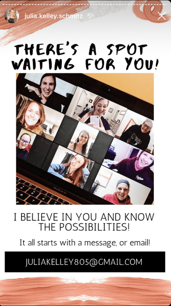
This Facebook ad example comes from a small brand and exudes a personal touch, showing that it is designed just for you.
With the message “There’s a spot waiting for you,” the ad reaches the viewers directly and provides an email where you can contact them to get a personalized service.
The ad also shares a simple picture with real people, making the viewers identify with them.
However, this approach can drive the fastest conversions to small businesses but might not work for large brands.
5. Vuori

The principal characteristic of this Facebook ad is the message. Everyone can buy joggers online, but what’s the difference between Vouri’s joggers and others?
This ad catches the attention by saying, “Softest jogger you’ll ever own,” promising a better product that stands out from their competitors.
Vouri uses a strong and direct message that highlights the value and benefits they offer in their products. This is a crucial strategy to generate conversions.
Why Advertise on Facebook?
Based on our experience dealing with social media ads, Facebook is one of the best platforms for advertising for entrepreneurs and business owners.
This social network allows you to create great Facebook ads when you follow their guidelines and use your creativity.
At the same time, the Facebook ads manager provides insights about your ad performance like no other. This allows you to plan ahead, make improvements, and build the best Facebook ad possible for your company.
Whether you are an online store, a new indie game developer, or a massive corporation like Nvidia, you can use ad campaigns to build community, increase sales, and provide value that can turn into user-generated content.
Facebook Ad Formats
Facebook Ads Manager offers a variety of ad types to fit your brand’s unique goals, each with its own ad creative possibilities.
These formats are designed to maximize your ad budget impact, highlight your message, and connect with your audience.

Image Ads
Image Ads consist of publishing a single image accompanied by a caption, a call-to-action, and a link.
We recommend a 1080 x 1080 pixels image resolution and a 4:5 aspect ratio for better quality. This last component varies depending on where the ad will be displayed (e.g., mobile feed, desktop feed, right column.)
Additionally, the file types recommended are JPEG and PNG.
They are great for showcasing a product or promoting a single message.
Video Ads
Videos on Facebook are a powerful way to showcase your product, service, or brand. They must be designed to capture attention quickly.
Some of the technical requirements for Facebook video ads you should consider are:
- The video can be as short as 1 second, like GIFS, and as long as 241 minutes. We recommend using 10 to 20-second video ads to show your products because viewers can get bored quickly with long videos.
- The video ad file should not exceed 4GB.
- For optimal quality, you should create videos with 1080 x 1080 pixels or more. However, this will depend on the device on which your video ad will be displayed, whether horizontal videos for desktops or vertical videos for mobiles.
Stories Ads
Facebook story ads provide an immersive experience, appearing organically full-screen between your friends’ stories. Designed to capture attention, they are enhanced with creative elements like stickers and emojis.
They’re ideal for showcasing your products or brand dynamically with images or short videos.
Stories ads range from 1 second to 2 minutes. If it’s longer than 10 seconds, they’re split into separate cards, with Facebook displaying up to 3 cards before prompting viewers to continue watching.
Messenger Ads
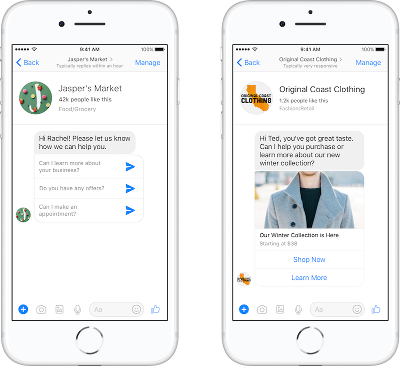
This format is a unique way to engage with users directly within the Facebook Messenger app. They appear in three ways:
- The app’s home feed, similar to Facebook ads, appears with an image, a description, and a CTA.
- As sponsored messages, which directly reach out to specific audiences.
- Click-through-Messenger, a CTA incorporated into the Facebook news feed ad that will lead the clients to a Messenger conversation.
These three options ensure visibility to users who frequently use the Messenger App.
Messenger ads provide an opportunity for real-time engagement. Users can instantly respond to the ad, ask questions, or even make a purchase, leading to higher conversion rates.
Carousel Ads
With Facebook Carousel Ads, you can showcase images or videos between 2 to 10 “cards” in one single ad. This format is helpful if you want to highlight a range of products, show different features, or even tell a sequential story.
For a carousel ad, we recommend using JPG or PNG image files and MP4, MOV, or GIF videos. They should have at least 1080 x 1080 pixels and a 1:1 ratio design.
These are not just visually engaging but also provide you with great opportunities to drive specific actions by including relevant call-to-action buttons and landing page URLs.
Slideshow Ads
Facebook Slideshow ads are designed to be a simple yet effective way to transmit a message using a series of static images that play in sequence, much like a video.
This format is perfect if you want to create video-like ads without the complexities and costs of video production.
These ads are especially valuable in regions with slower internet connections, as they consume less data than video ads. Enhanced with text and music, they offer versatility in storytelling or showing various aspects of your product or service.
Collection Ads
This format combines both video and image content with product listings, allowing potential customers to browse and purchase without leaving Facebook.
Collection ads are particularly beneficial for e-commerce businesses, as they showcase a primary video or image at the top with several smaller product images listed below.
When users tap on the ad, they’re taken to a full-screen visual display called the Instant Experience, where they can explore products in more detail.
This seamless mix of content and commerce provides viewers with a frictionless shopping journey, reducing the steps between discovering a product and purchasing. It’s also optimized for mobile shopping, ensuring a smooth and engaging experience even on smaller screens.
Dynamic Ads
Facebook dynamic ads have the principal ability to retarget users based on their online behavior. These are designed to capture the intent signals that customers show on websites and apps, ensuring that the right products are showcased to the right people.
For instance, if a user viewed a product but didn’t make a purchase, dynamic ads can remind them of that product, potentially leading them toward a purchase decision.
Their goal is to create a personalized shopping experience for users, increasing conversions.
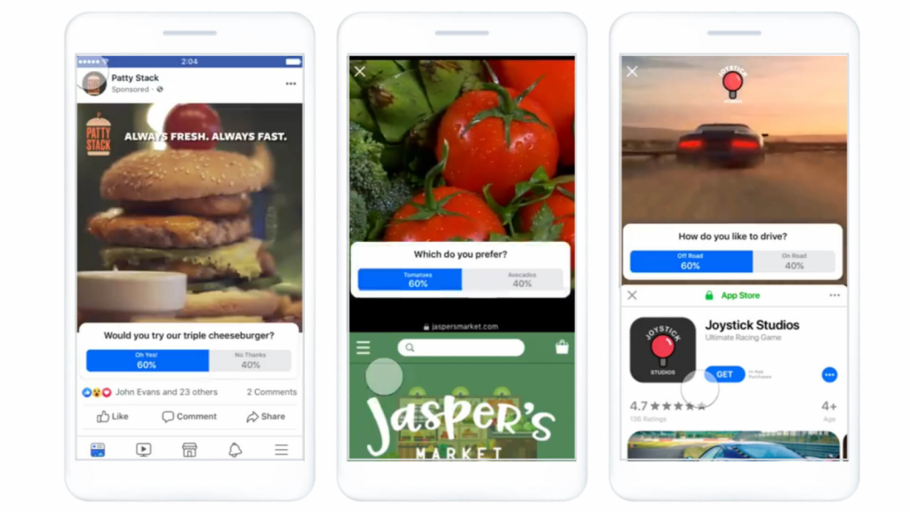
Poll Ads
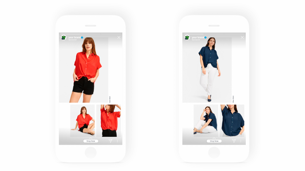
Poll ads on Facebook are interactive ads that incorporate a two-option poll, engaging users by allowing them to vote on a question or preference. This not only captures potential buyers’ attention but also provides insights into your audience’s preferences and opinions.
This ad format can lead to higher recall and brand awareness by prompting users to interact, making them a versatile tool for engagement and data collection.
Lead Ads
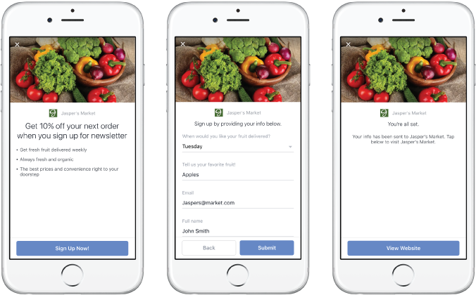
This ad format is a promotional advertisement designed to collect user information without requiring them to leave Facebook, which simplifies lead generation.
They present potential customers with a dorm where they can submit information about themselves, such as email, address, name, and phone number. This collecting data format provides a higher conversion rate and a list of qualified leads interested in your products or brand.
Moreover, these ads can be integrated directly with the Customer Relationship Management (CRM) system for further analysis and future usage.
Augmented Reality Ads
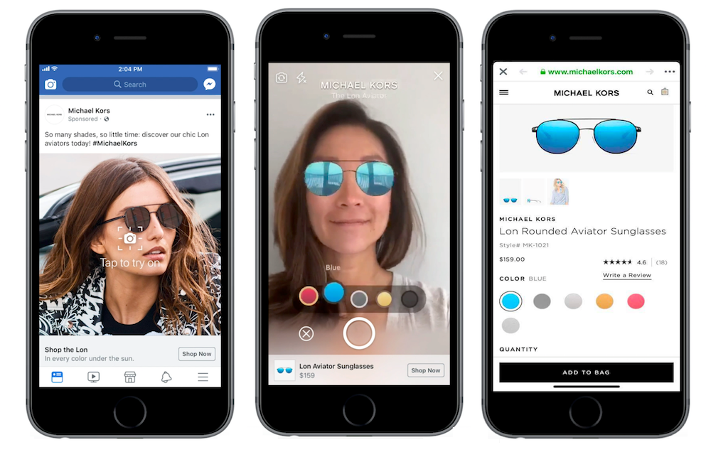
AR ads are a form of advertising that overlays digital visual elements, sound, or other sensory stimuli onto the real physical world, delivered via technology. They offer an interactive experience, allowing potential customers to engage with the ad in a more immersive way.
For example, working as a “filter,” users can try on a pair of sunglasses or visualize how an item of furniture might look in their living room.
Facebook Ad Campaign Best Practices
Are you trying to build the best Facebook ads?
Then you need to follow our best practices to make your ad creative:
- Clearly identify your market
- Build your buyer persona for your Facebook ad campaign.
- Research competitors and markets using tools like the Facebook ads library to gather inspiration.
- Analyze your current ad data if you’ve launched other ads.
- Establish clear metrics from comments, engagement, and user feedback.
- Prepare regular content updates for your ads.
- Iterate when possible
- Evaluate which ad format performs best.
- Ensure your ads are in the right funnel stage.
- Prepare A/B tests to ensure what works best.
- Explore worthy CTAs.
- Ensure responsiveness.
- See ad examples in the Facebook ad library.
- Give the brand touch
- Use original photos that align with your Facebook ad copy.
- Ensure you’re using the correct ad format and size.
- Prepare interactive ads.
- Use unique and appealing copywriting.
- Transmit a clear message with each ad.
- Keep making ads to improve
- Use ads to build authority.
- Differentiate your brand.
- Create new user personas.
- Change KPIs constantly to gather more data.
GamerSEO Makes The Facebook Ad Creation Process Easy
Having explored various Facebook ad examples and understood the nuances of different formats, it’s evident that Facebook has the potential to transform any campaign into successful conversions.
You can ensure that your next Facebook ads campaign captures the attention it deserves by incorporating the best practices we’ve discussed above.
But if you think this is hard or time-consuming, you’re right.
That’s why GamerSEO is here. We ensure your ads have the best performance in Facebook advertising while getting what every company wants: get more conversions while paying less money for ads.
Contact us to get started!

A PPC specialist who started with organic social media. For several years, the core of his activities are:- Google Ads, Microsoft Ads, Meta Ads, TikTok Ads, Twitter Ads, Linkedin Ads. He has led campaigns with a global reach, e.g. for FootballTeam, G2A, ETOTO, as well as many smaller campaigns in the sports, construction and financial industries. Has full focus on ROAS. Privately, a fan of football, history of wars and Star Wars.

