Mobile devices account for more than half of web traffic worldwide. In the first quarter of 2021, mobile devices (excluding tablets) generated 54.8 percent of global website traffic. The constantly growing importance of mobile remodeled how websites are built and used.
Today, web developers put major emphasis on providing a great experience for mobile users. And that comes as no surprise, considering that everything we do — from ordering food to searching for valuable content across the web — is done through a smartphone.
That being said, if your website isn’t mobile-optimized, you’re missing out on potential visitors, customers, and sales. Additionally, Google has implemented a set of policies that put mobile users as a priority, making mobile-friendly websites rank higher.
All that suggests that mobile website optimization isn’t optional anymore. But don’t worry, we are here to help you. From this article, you will learn:
- What is mobile optimization,
- Why having a mobile-optimized website is so important today,
- How to make your website mobile-optimized.
What is Mobile Optimization?
Mobile optimization is the process of adjusting your website content to ensure that people who visit the site from mobile devices have a comfortable mobile experience.
As mobile devices have small screens and users are often on the go, their comfort must be secured with proper optimization techniques. Therefore, a mobile-optimized website lets mobile visitors browse through your site’s content pleasantly, regardless if they are in a coffee shop or doing shopping in the market.
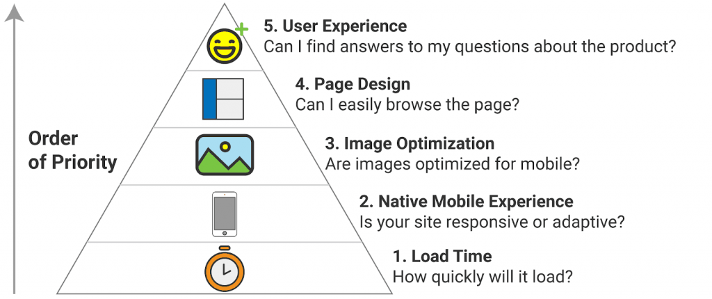
Below, you can see the “Mobile Optimizer’s Hierarchy of Needs” by Databox. It should give you a basic understanding of which factors should be taken care of while optimizing your website for mobile devices.
Why is Mobile Optimization Important?
The possibilities offered by mobile phones are growing rapidly, and so is the number of activities that users perform on their smartphones. This, of course, translates into the requirements that a mobile-optimized site should meet. With that being said, let’s check what the essentials are and why every business owner should take care of having a mobile site.
We are aware that user agents expect websites that can solve their doubts and needs without having to spend too much time on them.
Emails Are Mainly Read on Mobile Devices
According to the Emarsys 2018 study, email marketing remains the main tool for customer retention and acquisition by small and midsize businesses. The data reveals that 81% of SMBs still rely on email as their primary customer acquisition channel and 80% for retention.
What’s equally important is that 81% of all emails are opened and read on mobile devices. So it’s not difficult to guess what happens when the email or your business website isn’t mobile-friendly. Research shows that 80% of recipients delete the email instantly!
All the statistics and our experience with numerous campaigns prove that having a well-planned email marketing campaign isn’t enough, as a website that’s not optimized for mobile will most likely scare them away. Besides an incentive, they must be able to browse the landing pages of your online shop comfortably.
People Enjoy Mobile Shopping
Regardless of the mission or values companies stand for, everybody’s ultimate goal is increasing revenue. And as reported by Google, a big part of web users choose shopping via mobile rather than the desktop version.
Here are other eye-opening statistics:
- 57% of internet users say they won’t recommend a business with a poorly designed website on mobile;
- 88% of online consumers are less likely to return to a site after a bad experience.
There’s not much to say here as the data speaks for itself. In most cases, neglecting mobile optimization will have a critical impact on your sales and the image of your company.
Mobile Search Is Growing
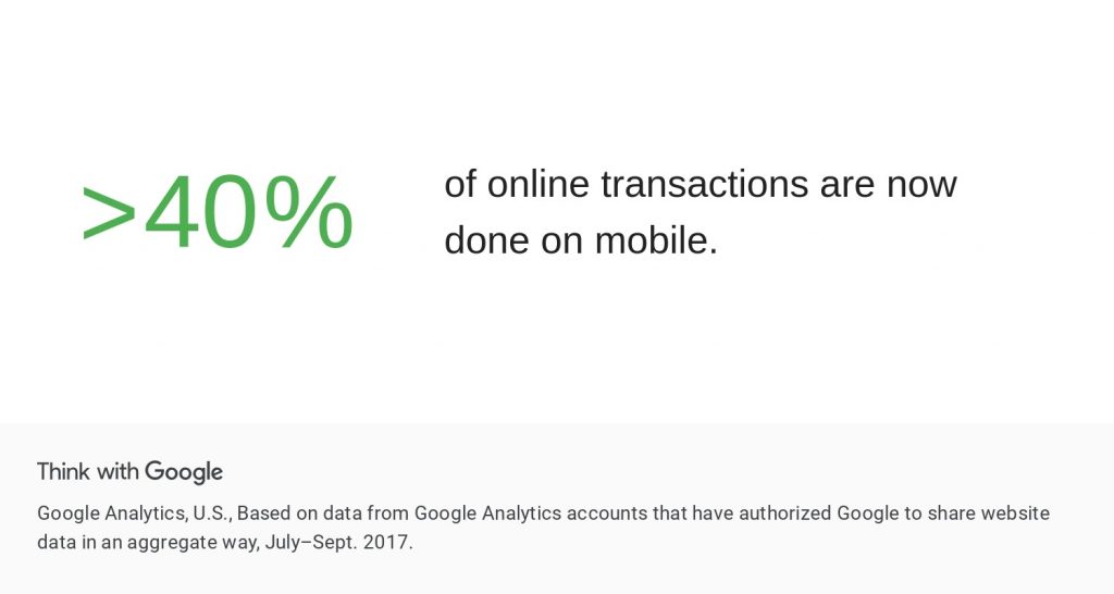
At the beginning of this article, we have mentioned that mobile devices generated 54.8% of global website traffic. However, the mobile traffic numbers limited to the US and Google only are even more striking.
With mobile gaining traction almost everywhere, Google search is no exception. When we take a look at the number of Google searches on each device, 63% of Google’s US organic search traffic originated from mobile devices.
This means many potential customers may find your eCommerce store while browsing the web on their mobile devices. Numerous experiments performed by our expert team indicate that having a mobile-friendly website is a must when you want to make a good impression on the mobile user. It is also fundamental when it comes to encouraging them to move down the marketing funnel.
Mobile-First Indexing
Are you wondering how to rank on Google’s first page? Think mobile-first!
In the past, Googlebot primarily used a website’s desktop version to check a page’s relevance to a search query, but this has since shifted to mobile versions.
Mobile-first indexing means Google primarily uses the mobile version of the content for indexing and ranking.
It’s called “mobile-first” because it’s not a mobile-only index. So even if you didn’t focus on developing a mobile-friendly website version, the desktop site could still be included in the index. On the other hand, the lack of a mobile-friendly experience could harm that page’s rankings. What’s more, a website that provides a good mobile experience may potentially result in a rankings boost even for desktop users.
We believe that this way of thinking is an entire process that has been developing over the years. Now, the best practice for securing the first positions in Google search results on a keyword needs to include optimizing the mobile version of your website.
Social Media and Mobile Optimization
As we live in an era where people are glued to the phone, they are exposed to product offers everywhere. That’s especially true for social media, as 55% of American shoppers have bought something online after discovering it on SoMe. They may find inspiration on their favorite influencer’s profile and opt to buy it in a heartbeat.
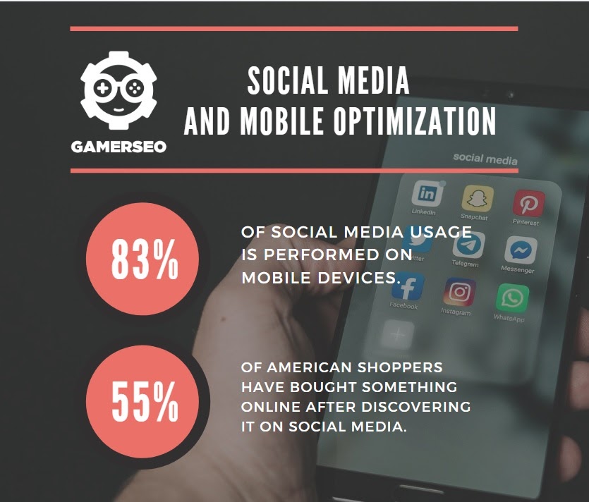
That’s when the importance of a mobile-optimized website comes into play. As about 83% of social media usage is performed on mobile devices, it’s highly unlikely that users will switch to a desktop while searching for the product. Therefore, to generate sales, you have to make sure that your website provides the best shopping experience when they land on your product pages.The influencer social media strategies that we have carried out with several clients confirm this. They managed to drastically increase their conversions thanks to the use of social media. This can be seen in our case studies.
How to Create a Mobile Optimized Website?
We already know what mobile optimization is and why it is so important in today’s eCommerce from the previous section. Let’s now focus on the necessary actions to improve the user experience and complete your business goals.
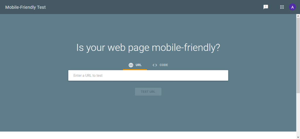
Test Your Site Using Google’s Mobile-Friendly Tool
Before you start taking any action, it’s worth checking how your site is currently performing in terms of mobile-friendliness. To do this, use a free tool from Google – Mobile-Friendly tool. Thanks to this, you will receive a report on the current state of the website and tips on potential improvements.
It is also worth using the manual method, i.e., simply checking how the website performs on the level of different devices. For example, when browsing it on a desktop computer, tablet, and your iPhone, pay attention to page load times and responsive design on a smaller screen.
If any elements cause an uncomfortable experience, you will know what needs adjustments. Usually, the features that are first visible have the most significant impact on the functioning of the website.
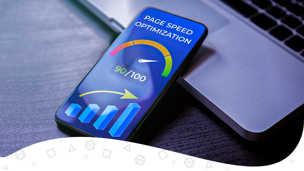
Optimize Page Speed
Page speed (or your website loading speed) is a major aspect of mobile search engine optimization (SEO). With many tests that we have run for our clients, we can safely say that web performance impacts not only search rankings but also the user’s mobile experience.
Desktop computers’ advantage is that they have better components, and they are often connected to a more stable internet connection, which also affects the page load speed. Unfortunately, we don’t have an influence on these factors. However, several other activities can help make your site run faster:
- Use caching. With caching, your files are saved in a more convenient location (such as on each visitor’s local device), so the user’s device doesn’t have to download them every time a new page is accessed.
- Try a Content Delivery Network (CDN). CDN lets you store copies of files in various servers that are spread out in different geographical locations. This tactic may improve the loading times of users who live far away from your server’s location.
- Compress your images. Large image files are often slowing downloading times. By compressing and resizing images, you can reduce the file size without affecting its quality. To do it, have a look at the ShortPixel plugin and the TinyPNG tool.
- Reduce your code. By optimizing your site’s CSS, HTML, and JavaScript code, you can positively influence your page load times.
Update your software. Using outdated software not only results in safety issues but also limits your website’s performance. Therefore, keep your plugins, themes, and CMS updated to stay away from such problems.
| Want your page to load quickly? We have devoted a separate post that covers all essential information regarding site speed. To find out how to improve the page speed regarding desktop and mobile devices, head to the post Does Page Speed Affect SEO? Avoid These Mistakes! |
Create Responsive Web Design
Responsive Web design is the approach that suggests that design and development should respond to the user’s behavior and environment based on screen size, platform, and orientation.
Responsive designs use media queries to target the layout based on screen width, orientation, and resolution. Then, as the user switches from laptop to tablet or smartphone, the website automatically adjusts to ensure the best user experience.
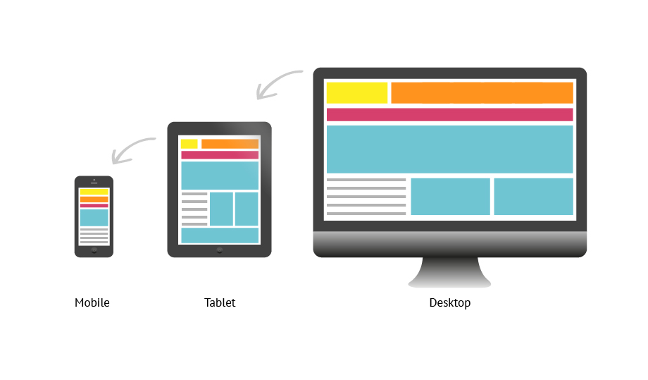
The navigation of a responsive site changes on other mobile devices, giving users easy access to the website’s content on smaller displays. In responsive websites, the size of fonts, spacing, images, and all other website appearance elements are also adjusted.
These changes make the website more convenient, increasing its content readability. Thanks to it, users’ comfort won’t differ much from desktop experiences. As a result, they won’t be scared off while viewing the page on a small screen.
When working on website improvements for our clients, we always pay attention to the mobile device experience along with the desktop browser version. A mobile-friendly site is a fundament if you are thinking about gaining a competitive edge in the digital world.
Optimize for Touch Screens
As the mobile screen is small compared to other devices, it requires special optimization to provide comfort for users.
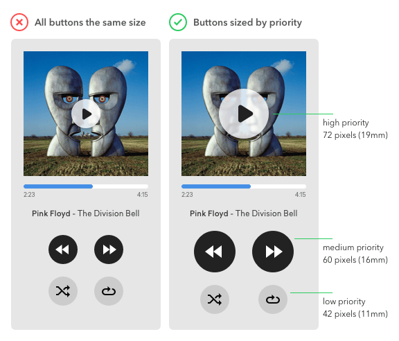
When optimizing your website for touch screens, make sure your mobile design will be well adapted for fingers of different sizes.
Have you ever had to zoom in to click the appropriate button or menu item?
If so, then you know it’s probably one of the most annoying issues regarding mobile screens. Thus, it makes sense to create website elements big enough to navigate through the website easily. This way, you let users access particular services or features and perform common tasks without accidental taps and errors.
Enable Google Accelerated Mobile Pages (AMP) Markup
As Google puts user experience first, they want to deliver information as fast as possible no matter which device people are using. To achieve this, they have created the Accelerated Mobile Page project, which is designed to help businesses develop mobile-optimized content that loads faster on every device. AMP reduces mobile pages to their bare minimum, removing all the unnecessary elements to allow quicker browsing on a limited-speed mobile network.
When you optimize your site for AMP, it’s like creating two websites at the same time – one for mobile devices and another one for everything else.
If you decide to implement AMP markup on your website, you may gain serious SEO benefits:
- Firstly, AMP websites are ranked highly, sometimes even above paid ads within search results (look below).

- Secondly, AMP can be used to boost your content’s loading speeds and appearance. This translates into user experience, which may also indirectly affect your search engine rankings.
Stay Away from Intrusive Pop-Up Windows
Navigation through too many different tabs on a mobile device can be frustrating. That being said, having pop-up windows will have a negative effect not only on the general loading time but also on user comfort and overall opinion regarding your website design.
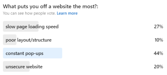
Google has clearly stated that it doesn’t recommend implementing pop-ups that display right away. It has been said in both the “intrusive interstitials” article and the Search Quality Raters’ guidelines.
Here are 3 solution tips for displaying SEO-friendly pop-ups:
| – Add a delay before displaying the pop-up. – Add a scroll condition (e.g. display the pop-up once your visitor has seen a certain percentage of the page). – Use exit-intent pop-ups. |
From our point of view, to improve user experience, you should make it easy for visitors to close any pop-up at any time, preferably with just one click of a button regardless of the device. In short, make sure consumers know how to go back to the original page after they’ve been presented with a pop-up window.
Use Structured Data
Structured data is a standardized format for providing information about a page’s content. In simple terms, you let Google and other search engines know what your website is about.

Structured data allows Google to display rich snippets (see above). They enrich your website in SERPs with additional information, taking over more space and grabbing attention. As smartphones have smaller screens than almost any other device, rich results are even more visible in the mobile browser.
Conclusions
As we live in a mobile-first world, having a mobile-optimized version of your website is essential for every business online, regardless if we are talking about a non-profit organization, large enterprise, or small business. Ensuring the comfort of using your e-Commerce store with just a few clicks on any device type is a key to increasing conversion rates as well as driving more traffic from search engines and social media platforms.
As we have analyzed numerous data regarding our clients’ websites, we are aware that more and more visits come from mobile devices. It shows that nowadays businesses should focus on methods that will let them increase mobile conversion rates. Therefore, a mobile-optimized online store is just a step in the right direction if small business owners want to succeed in the digital world.
| Are you looking for more information regarding SEO activities and marketing in the gaming industry? Good news: We have it covered! Head out to our blog and read the latest posts or reach GamerSEO experts via this easily accessible contact form to get all the useful information you need. |
What do you think about this article? Leave feedback in the comment section below!
FAQ
What Is a Mobile-Optimized Website?
A mobile-optimized website is a site that has the following characteristics:
- It loads quickly on mobile devices,
- It has a responsive design – the site’s design and content adjusts to the different screen sizes,
- It’s easy to navigate – the menu and navigation elements are well organized, enabling mobile to browse through the website while holding the phone easily,
- It’s free from intrusive pop-ups.
How Do I Optimize My Website for Mobile?
To make sure your mobile presence is on point, go through the following check-list:
- Perform a test via Google’s Mobile-Friendly Tool,
- If you are one of WordPress users, choose a responsive theme,
- Improve your page’s load speed,
- Adjust the size of buttons on your page,
- Remove annoying pop-ups and design them specifically for mobile,
- Enable Google Accelerated Mobile Pages (AMP) markup.
Why Should You Optimize Your Website For Mobile Users?
Optimizing your site for mobile devices is important because:
- Emails are mainly read on mobile devices,
- People do more and more shopping on mobile,
- More than a half of organic search traffic originates from mobile devices,
- Google introduced mobile-first indexing,
- More than 80% of social media usage is performed on mobile devices.

SEO enthusiast and digital marketing strategist. My expertise lies in optimizing websites for organic traffic growth and search engine visibility. I carry out, among others, SEO tests, keyword research and analytical activities using Google Analytics. Privately, he is a lover of mountains and bicycle trips.